
I stopped counting the dashboards I’d built somewhere around 2014. Hundreds by then. The pretty ones? Long forgotten.
The ones that stuck around were ugly little things that answered a question before the meeting even kicked off.
That’s the lens here. Not wall art. It’s what someone opens before the first coffee goes cold, and it earns that spot every morning, or it doesn’t.
What’s the Difference Between a Dashboard, a Report and a Template?
Many sling these three words about like they mean the same thing. They don’t. And that muddle quietly eats hours nobody gets back.
A dashboard is a one-page glance. A report is the fat, multi-page thing sitting behind it where you go digging for the why. A template is somebody else’s head start that you pour your own data into.
So when people search for Power BI report examples, they usually want the detailed version. Power BI dashboard templates? That’s the shortcut. If none of this is landing yet, our explainer on what is Power BI eases you in.
10 Power BI Dashboard Examples that Drive Real Decisions
I’ve sorted these by who actually uses them. Build for the person squinting at the screen at 8 am, not for whatever data happened to be lying around.
1. Executive KPI Dashboard
Owners, directors, the board. One screen, no scrolling.
Keep it ruthless. More than eight tiles up there, and you’ve already lost them.
What goes on it: revenue against plan, gross margin, the cash position, what it costs to win a customer, and whether the headcount is actually pulling its weight.
2. Sales Pipeline Dashboard
The best one I ever shipped did exactly one thing. It showed where deals went to die. Win rate, deal size, how long the cycle dragged on, who on the team was actually carrying it.
The clever bit was sticking actuals right next to the plan. Side by side. So by 9 am, a sales manager knew whether the day ahead was a good one or a long slog.
Worth watching here: win rate, average deal size, sales cycle length, pipeline value, and rep performance.
3. Financial and CFO Dashboard
Finance teams live in spreadsheets and quietly resent it. A decent financial dashboard hauls the P&L, balance sheet, cash flow and budget variance into one spot.
The Aussie owners I deal with fixate on one thing. Cash. Split the operating flows from the investing ones, and that 2 am question finally gets an answer: we made a profit, so where the heck did the money go?
The figures that earn a place: net profit, operating cash flow, days sales outstanding, budget variance, and gross margin.
4. Marketing Performance Dashboard
No function scatters its data across more tools than marketing does. Bit of a shambles, most days.
So wire up the channels you actually run. Not the twelve you signed up for one Friday and never touched again.
Keep tabs on spend by channel, cost per lead, conversion rate, ROAS, and how much pipeline marketing really sourced.
5. Operations and Supply Chain Dashboard
Here’s where Power BI quietly prints money. Inventory, supplier scorecards, output, machine effectiveness, all the unglamorous stuff nobody brags about.
There’s a real one of these coming up in a tick. The numbers caught even me off guard.
The ones I’d put up: on-time delivery, stockouts, lead time, inventory value, supplier performance.
6. HR and Workforce Dashboard
Headcount, churn, time-to-hire, sick days. The people’s story, finally in numbers, leadership can’t just wave away.
Good ones whisper a warning before the resignation email ever lands.
Track headcount, turnover rate, time-to-hire, absenteeism, and how much of the training actually got finished.
7. Healthcare and Patient Dashboard
Across Australian health services, Power BI has quietly become the reporting backbone. Patient flow, wait times, beds, the lot.
Tread carefully here, mind you. Patient data has privacy rules behind it that a sales report never has to think about, and I’ll get to that further down.
What goes up on these: patient flow, average wait time, bed occupancy, readmission rate, staff-to-patient ratio.
8. Retail and Ecommerce Dashboard
Retailers are soaked in transaction data and parched for actual insight. A sharp retail dashboard stitches sales, basket size and stock back together.
Then, at a glance, you spot what to reorder and what to mark down before it just sits there gathering dust.
Worth a look: sales by store, average basket value, conversion rate, stock turn, and what keeps coming back as returns.
9. Manufacturing and ERP Dashboard
Manufacturers aren’t short on data. They’re short on answers, and those answers are already buried somewhere in the ERP.
Wire it up to SAP or Infor, point it at one decision on the shop floor, and the line supervisor finally knows where the day went sideways.
Keep an eye on OEE, scrap rate, actual against standard labour hours, the order backlog, and throughput.
10. Project and Portfolio Dashboard
Services firms and PMOs, this one’s the honesty machine. Budget burn, milestones slipping, who’s drowning and who’s coasting.
Every live project, one page. No more chasing status updates over email all afternoon.
The numbers that count: budget versus actual, milestone status, resource utilisation, billable ratio, project margin.
Quick cheat sheet for matching the example to the decision it actually serves.
| Dashboard Type | Primary User | The Decision It Drives |
| Executive KPI | Owners, board | Is the business on track this month? |
| Sales Pipeline | Sales managers | Where do we focus to hit target? |
| Financial / CFO | Finance leaders | Where is cash going, and why? |
| Marketing | Marketing leads | Which channels deserve more budget? |
| Operations | Ops managers | What needs fixing before it breaks? |
| HR / Workforce | People teams | Who is at risk of leaving? |
| Healthcare | Clinical leads | Where are patients waiting too long? |
| Retail / Ecommerce | Store, merch teams | What do we reorder or discount? |
| Manufacturing | Plant managers | Where are we losing output? |
| Project / Portfolio | PMOs, delivery | Which projects are slipping? |
A Real Power BI Dashboard Case Study
Examples are nice. Outcomes are what get a dashboard funded. Here’s one from my own files, numbers nudged a bit for privacy.
- The challenge: A Melbourne logistics mob kept running dry on fast movers while dead stock gathered dust in another warehouse. The data was all there, scattered across three systems, and nobody could see the whole picture at once.
- What we built: One operations dashboard. Livestock, reorder points, supplier lead times, all in a single view, anything below the threshold flashes red.
- The result: Stockouts fell by roughly a third in a single quarter. No new ERP. No extra hires. Just the right people seeing the right numbers over their morning coffee.
That’s the whole point, really. If a dashboard doesn’t change what somebody does next, why bother building it?
Best Power BI Reporting Templates to Start From
No need to start from a blank canvas. Helps to think of Power BI reporting templates as two different beasts.
Reusable ones let you wire up your own data and report straight away. Study-only ones you can’t plug into, but they’re worth a long look for layout and which metrics earned a spot.
For the reusable kind, Microsoft tucks free sample reports inside Power BI itself, and the likes of Zebra BI, Coupler.io, and ZoomCharts hand out downloadable .pbix files for sales, finance and marketing. Some are free, some are behind a trial.
My two cents after all these years? Treat a template as bones, never the finished body, and bin every visual that doesn’t earn its glance. Want one shaped around your actual numbers? Our data analytics consulting crew does precisely that.
What Makes the Best Power BI Dashboards Stand Out?
Twenty years in, I can usually call it inside ten seconds. Will this thing get opened tomorrow, or quietly rot in a folder?
The good ones answer the question before you’ve finished asking it. They lean on a handful of chart types instead of eleven. And they load fast, because nobody waits on a slow dashboard, they just stop opening it.
Colour has to mean something too. On one I’d trust, red is trouble and green is fine, grey just sits there for context, and nothing’s on the page looking pretty for no reason. That kind of restraint is brutally hard, which is exactly where good data visualization services earn their fee.
The great ones go a step past that. They don’t just tell you what happened; they nudge you on whether it’s a problem and how big a one.
What’s Changed for Power BI Dashboards in 2026?
The platform’s moved further in two years than in the five before it. If your reports still smell like 2022, you’re leaving money on the table.
Copilot’s the big shift. Type a plain-English question, something like show me revenue by state this quarter, and a formatted chart lands in seconds. Microsoft reckons Copilot users shave about 40 per cent off their report-building time.
Then there’s Fabric, which has tucked Power BI into a bigger data platform, Direct Lake storage and all, for quicker loads on chunky models. For most mid-market firms, the upshot is plain enough. Natural language queries and AI-flagged anomalies are just table stakes now, which is why decent Power BI consulting leans on strategy far more than clicking buttons.
Power BI vs Other Data Visualization Software
People still ask me if Power BI’s the right horse to back. For most Australian businesses, yeah, and the figures hold it up.
It owns close to a third of the global business intelligence tools market, miles ahead of Tableau in second. Pays for itself inside a year for most shops. Over 112,000 companies worldwide were running it in 2026.
Tableau and Qlik are still cracking data visualization software, especially for the heavy stats crowd. But if your world is already Microsoft 365, the way it slots into Excel, Azure and Teams makes it tough to beat on value.
How Should Australian Businesses Approach Power BI Reporting?
This is where the global guides go quiet, and the local stuff starts to matter. BI maturity here is all over the shop, sector to sector.
Financial services and mining are out front. Healthcare and government are gaining ground. Which means if you’re in retail, professional services or logistics, a sharp dashboard still buys you a genuine edge.
Now the bit everyone skips. Privacy. If your dashboards touch customer or patient records, the Privacy Act 1988 and the Australian Privacy Principles decide how you store and share them.
Row-level security is your mate here. A switched-on managed IT services provider sorts the governance out before a single tile goes anywhere near production.
Where to Take Your Power BI Reporting Next
If one thing sticks from all this, make it the decision-first habit. Pick the question, grab the example that answers it, borrow a template, and get moving.
The businesses winning with data rarely own the flashiest charts. They’re the ones who built something people actually open, trust and act on, day after day.
Fancy a second set of eyes on your reporting? Contact us, and we’ll talk it through, no jargon, just a straight yarn about what your numbers have been trying to tell you.
Frequently Asked Questions
1. What is the best Power BI dashboard example for a small business?
Start with an executive KPI dashboard. It hands owners one view of revenue, cash and a few operational numbers without burying them in detail.
2. Are Power BI dashboard templates free?
Plenty are. Microsoft bundles free sample reports, though the slicker templates often sit behind a paid plan or a trial.
3. What is the difference between a Power BI dashboard and a report?
A dashboard is a one-page summary for fast calls. A report is the deeper, multi-page thing where you dig into the why.
4. How many visuals should a Power BI dashboard have?
Fewer than you’d guess. Three to six well-chosen visuals almost always beat a crowded screen.
5. What are the most common Power BI dashboard examples by industry?
Sales, finance, marketing, operations, HR and healthcare lead the pack. Retail, manufacturing and project reporting aren’t far behind.
6. Is Power BI good for Australian compliance requirements?
It can be, if set up right. Row-level security and Azure controls help you meet Privacy Act 1988 obligations, but the governance needs deliberate work, not defaults.
7. Can Power BI connect to my existing data sources?
Almost certainly. Excel, SQL databases, cloud apps, hundreds of others- it talks to the lot.










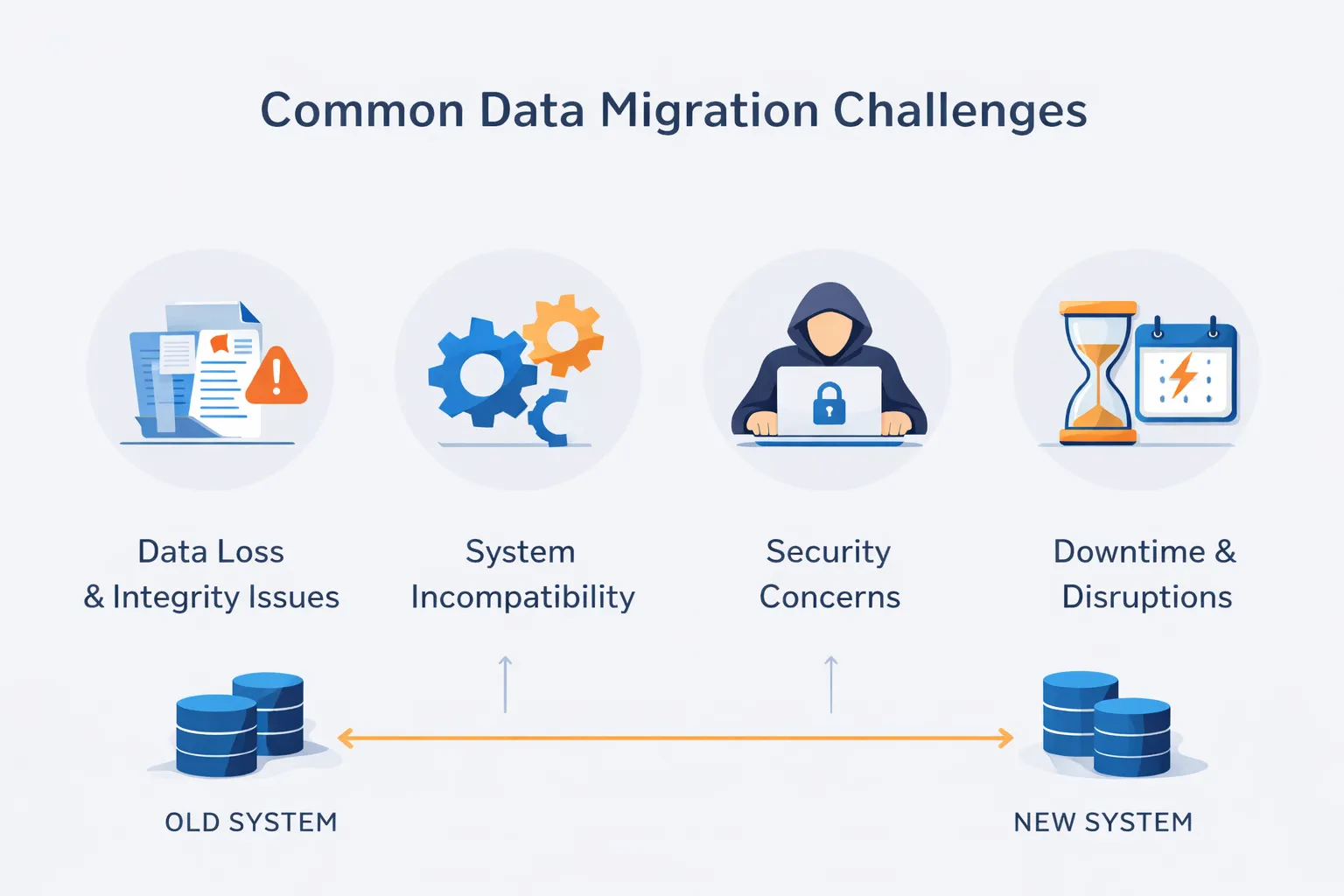
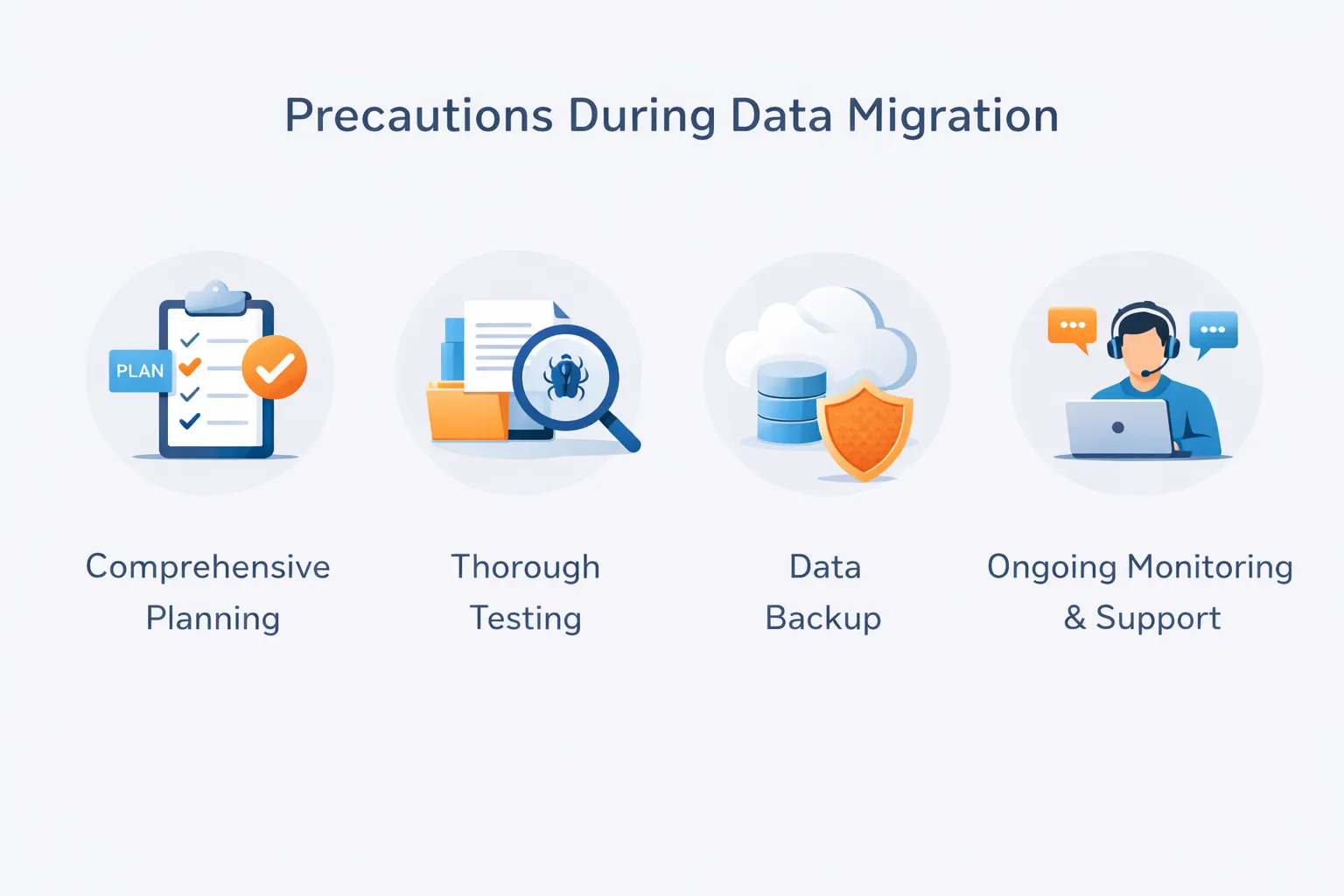

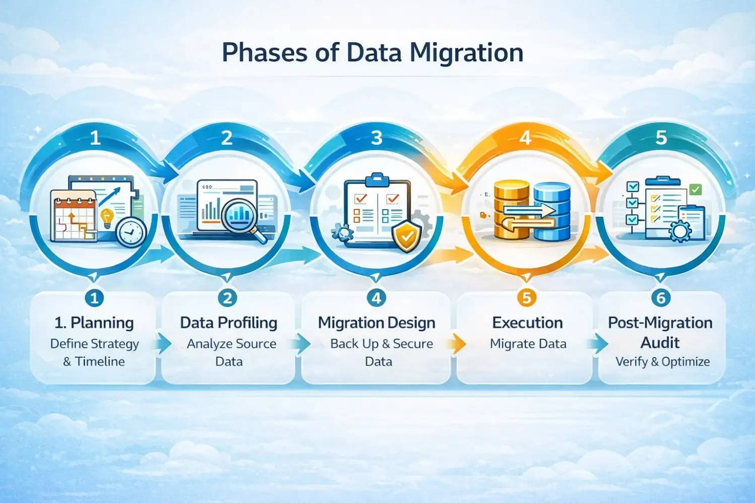
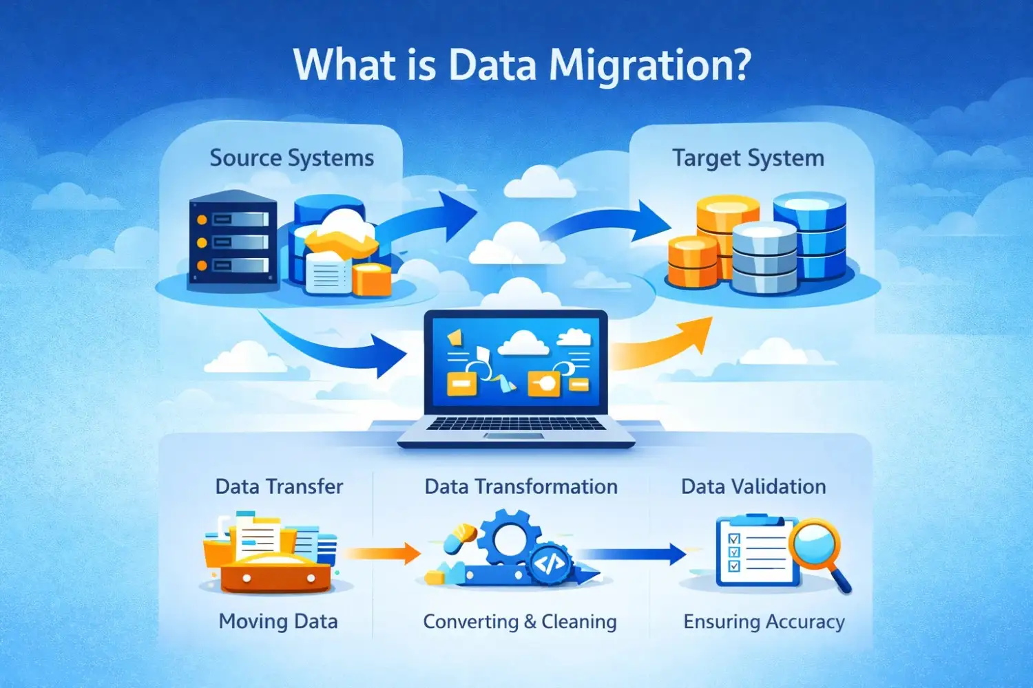 Data migration is the process of moving data from one system to another. It may be either a source for a new database or a local-to-the-cloud source.