
Categories
Blog Data Visualization Power BI

Top Power BI Dashboard Examples & Reporting Templates for 2026

I stopped counting the dashboards I’d built somewhere around 2014. Hundreds by then. The pretty ones? Long forgotten.

The ones that stuck around were ugly little things that answered a question before the meeting even kicked off.

That’s the lens here. Not wall art. It’s what someone opens before the first coffee goes cold, and it earns that spot every morning, or it doesn’t.

What’s the Difference Between a Dashboard, a Report and a Template?

Many sling these three words about like they mean the same thing. They don’t. And that muddle quietly eats hours nobody gets back.

A dashboard is a one-page glance. A report is the fat, multi-page thing sitting behind it where you go digging for the why. A template is somebody else’s head start that you pour your own data into.

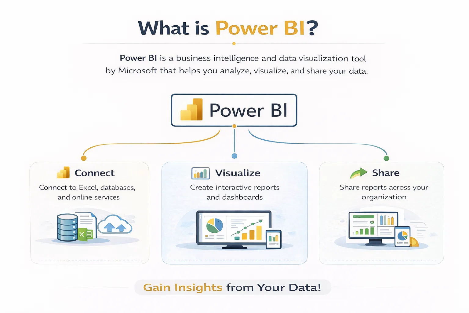
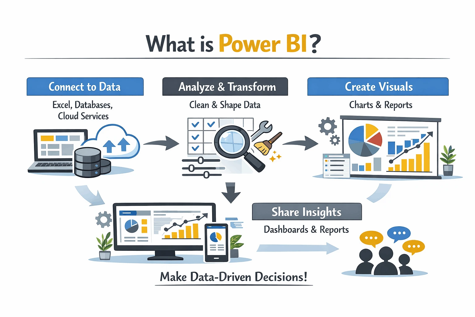
So when people search for Power BI report examples, they usually want the detailed version. Power BI dashboard templates? That’s the shortcut. If none of this is landing yet, our explainer on what is Power BI eases you in.

10 Power BI Dashboard Examples that Drive Real Decisions

I’ve sorted these by who actually uses them. Build for the person squinting at the screen at 8 am, not for whatever data happened to be lying around.

1. Executive KPI Dashboard

Owners, directors, the board. One screen, no scrolling.

Keep it ruthless. More than eight tiles up there, and you’ve already lost them.

What goes on it: revenue against plan, gross margin, the cash position, what it costs to win a customer, and whether the headcount is actually pulling its weight.

2. Sales Pipeline Dashboard

The best one I ever shipped did exactly one thing. It showed where deals went to die. Win rate, deal size, how long the cycle dragged on, who on the team was actually carrying it.

The clever bit was sticking actuals right next to the plan. Side by side. So by 9 am, a sales manager knew whether the day ahead was a good one or a long slog.

Worth watching here: win rate, average deal size, sales cycle length, pipeline value, and rep performance.

3. Financial and CFO Dashboard

Finance teams live in spreadsheets and quietly resent it. A decent financial dashboard hauls the P&L, balance sheet, cash flow and budget variance into one spot.

The Aussie owners I deal with fixate on one thing. Cash. Split the operating flows from the investing ones, and that 2 am question finally gets an answer: we made a profit, so where the heck did the money go?

The figures that earn a place: net profit, operating cash flow, days sales outstanding, budget variance, and gross margin.

4. Marketing Performance Dashboard

No function scatters its data across more tools than marketing does. Bit of a shambles, most days.

So wire up the channels you actually run. Not the twelve you signed up for one Friday and never touched again.

Keep tabs on spend by channel, cost per lead, conversion rate, ROAS, and how much pipeline marketing really sourced.

5. Operations and Supply Chain Dashboard

Here’s where Power BI quietly prints money. Inventory, supplier scorecards, output, machine effectiveness, all the unglamorous stuff nobody brags about.

There’s a real one of these coming up in a tick. The numbers caught even me off guard.

The ones I’d put up: on-time delivery, stockouts, lead time, inventory value, supplier performance.

6. HR and Workforce Dashboard

Headcount, churn, time-to-hire, sick days. The people’s story, finally in numbers, leadership can’t just wave away.

Good ones whisper a warning before the resignation email ever lands.

Track headcount, turnover rate, time-to-hire, absenteeism, and how much of the training actually got finished.

7. Healthcare and Patient Dashboard

Across Australian health services, Power BI has quietly become the reporting backbone. Patient flow, wait times, beds, the lot.

Tread carefully here, mind you. Patient data has privacy rules behind it that a sales report never has to think about, and I’ll get to that further down.

What goes up on these: patient flow, average wait time, bed occupancy, readmission rate, staff-to-patient ratio.

8. Retail and Ecommerce Dashboard

Retailers are soaked in transaction data and parched for actual insight. A sharp retail dashboard stitches sales, basket size and stock back together.

Then, at a glance, you spot what to reorder and what to mark down before it just sits there gathering dust.

Worth a look: sales by store, average basket value, conversion rate, stock turn, and what keeps coming back as returns.

9. Manufacturing and ERP Dashboard

Manufacturers aren’t short on data. They’re short on answers, and those answers are already buried somewhere in the ERP.

Wire it up to SAP or Infor, point it at one decision on the shop floor, and the line supervisor finally knows where the day went sideways.

Keep an eye on OEE, scrap rate, actual against standard labour hours, the order backlog, and throughput.

10. Project and Portfolio Dashboard

Services firms and PMOs, this one’s the honesty machine. Budget burn, milestones slipping, who’s drowning and who’s coasting.

Every live project, one page. No more chasing status updates over email all afternoon.

The numbers that count: budget versus actual, milestone status, resource utilisation, billable ratio, project margin.

Quick cheat sheet for matching the example to the decision it actually serves.

Dashboard Type Primary User The Decision It Drives
Executive KPI Owners, board Is the business on track this month?
Sales Pipeline Sales managers Where do we focus to hit target?
Financial / CFO Finance leaders Where is cash going, and why?
Marketing Marketing leads Which channels deserve more budget?
Operations Ops managers What needs fixing before it breaks?
HR / Workforce People teams Who is at risk of leaving?
Healthcare Clinical leads Where are patients waiting too long?
Retail / Ecommerce Store, merch teams What do we reorder or discount?
Manufacturing Plant managers Where are we losing output?
Project / Portfolio PMOs, delivery Which projects are slipping?

A Real Power BI Dashboard Case Study

Examples are nice. Outcomes are what get a dashboard funded. Here’s one from my own files, numbers nudged a bit for privacy.

  • The challenge: A Melbourne logistics mob kept running dry on fast movers while dead stock gathered dust in another warehouse. The data was all there, scattered across three systems, and nobody could see the whole picture at once.
  • What we built: One operations dashboard. Livestock, reorder points, supplier lead times, all in a single view, anything below the threshold flashes red.
  • The result: Stockouts fell by roughly a third in a single quarter. No new ERP. No extra hires. Just the right people seeing the right numbers over their morning coffee.

That’s the whole point, really. If a dashboard doesn’t change what somebody does next, why bother building it?

Best Power BI Reporting Templates to Start From

No need to start from a blank canvas. Helps to think of Power BI reporting templates as two different beasts.

Reusable ones let you wire up your own data and report straight away. Study-only ones you can’t plug into, but they’re worth a long look for layout and which metrics earned a spot.

For the reusable kind, Microsoft tucks free sample reports inside Power BI itself, and the likes of Zebra BI, Coupler.io, and ZoomCharts hand out downloadable .pbix files for sales, finance and marketing. Some are free, some are behind a trial.

My two cents after all these years? Treat a template as bones, never the finished body, and bin every visual that doesn’t earn its glance. Want one shaped around your actual numbers? Our data analytics consulting crew does precisely that.

What Makes the Best Power BI Dashboards Stand Out?

Twenty years in, I can usually call it inside ten seconds. Will this thing get opened tomorrow, or quietly rot in a folder?

The good ones answer the question before you’ve finished asking it. They lean on a handful of chart types instead of eleven. And they load fast, because nobody waits on a slow dashboard, they just stop opening it.

Colour has to mean something too. On one I’d trust, red is trouble and green is fine, grey just sits there for context, and nothing’s on the page looking pretty for no reason. That kind of restraint is brutally hard, which is exactly where good data visualization services earn their fee.

The great ones go a step past that. They don’t just tell you what happened; they nudge you on whether it’s a problem and how big a one.

What’s Changed for Power BI Dashboards in 2026?

The platform’s moved further in two years than in the five before it. If your reports still smell like 2022, you’re leaving money on the table.

Copilot’s the big shift. Type a plain-English question, something like show me revenue by state this quarter, and a formatted chart lands in seconds. Microsoft reckons Copilot users shave about 40 per cent off their report-building time.

Then there’s Fabric, which has tucked Power BI into a bigger data platform, Direct Lake storage and all, for quicker loads on chunky models. For most mid-market firms, the upshot is plain enough. Natural language queries and AI-flagged anomalies are just table stakes now, which is why decent Power BI consulting leans on strategy far more than clicking buttons.

Power BI vs Other Data Visualization Software

People still ask me if Power BI’s the right horse to back. For most Australian businesses, yeah, and the figures hold it up.

It owns close to a third of the global business intelligence tools market, miles ahead of Tableau in second. Pays for itself inside a year for most shops. Over 112,000 companies worldwide were running it in 2026.

Tableau and Qlik are still cracking data visualization software, especially for the heavy stats crowd. But if your world is already Microsoft 365, the way it slots into Excel, Azure and Teams makes it tough to beat on value.

How Should Australian Businesses Approach Power BI Reporting?

This is where the global guides go quiet, and the local stuff starts to matter. BI maturity here is all over the shop, sector to sector.

Financial services and mining are out front. Healthcare and government are gaining ground. Which means if you’re in retail, professional services or logistics, a sharp dashboard still buys you a genuine edge.

Now the bit everyone skips. Privacy. If your dashboards touch customer or patient records, the Privacy Act 1988 and the Australian Privacy Principles decide how you store and share them.

Row-level security is your mate here. A switched-on managed IT services provider sorts the governance out before a single tile goes anywhere near production.

Where to Take Your Power BI Reporting Next

If one thing sticks from all this, make it the decision-first habit. Pick the question, grab the example that answers it, borrow a template, and get moving.

The businesses winning with data rarely own the flashiest charts. They’re the ones who built something people actually open, trust and act on, day after day.

Fancy a second set of eyes on your reporting? Contact us, and we’ll talk it through, no jargon, just a straight yarn about what your numbers have been trying to tell you.

Frequently Asked Questions

1. What is the best Power BI dashboard example for a small business? 

Start with an executive KPI dashboard. It hands owners one view of revenue, cash and a few operational numbers without burying them in detail.

2. Are Power BI dashboard templates free? 

Plenty are. Microsoft bundles free sample reports, though the slicker templates often sit behind a paid plan or a trial.

3. What is the difference between a Power BI dashboard and a report? 

A dashboard is a one-page summary for fast calls. A report is the deeper, multi-page thing where you dig into the why.

4. How many visuals should a Power BI dashboard have? 

Fewer than you’d guess. Three to six well-chosen visuals almost always beat a crowded screen.

5. What are the most common Power BI dashboard examples by industry? 

Sales, finance, marketing, operations, HR and healthcare lead the pack. Retail, manufacturing and project reporting aren’t far behind.

6. Is Power BI good for Australian compliance requirements? 

It can be, if set up right. Row-level security and Azure controls help you meet Privacy Act 1988 obligations, but the governance needs deliberate work, not defaults.

7. Can Power BI connect to my existing data sources? 

Almost certainly. Excel, SQL databases, cloud apps, hundreds of others- it talks to the lot.

Categories
Blog Data Visualization

Top 15 Data Visualization Techniques Every Analyst Should Know (2026)

Pick the wrong chart, and even brilliant data says nothing. I learned that over twenty years ago, presenting a quarterly review off a pie chart no one in the room could read.

Choosing well is the whole game. Get it right, and a wall of numbers becomes a decision. Get it wrong, and the insight just sits there.

This guide runs through the fifteen data visualization techniques I reach for most. When each one earns its place. When it misleads.

What Are Data Visualization Techniques?

Strip away the jargon, and data visualization techniques are just the visual ways we make numbers readable. Charts, plots, maps, dashboards, the lot. Each one encodes the same data a little differently, which is precisely why the choice matters.

The whole point is comprehension, nothing fancier. Get it right and the visual answers the question before your audience thinks to ask it.

How Do You Choose The Right Technique?

Start with the question, never the chart. I have sat beside analysts who open Power BI, freeze, then scroll the chart picker, hoping one jumps out. That is backwards.

Ask what your reader needs to take away from it. Are they comparing things, tracking a trend, testing a relationship, eyeing a distribution, or splitting a whole? That answer steers you toward the right family of charts.

Counting your variables helps too. One variable points to histograms and box plots, two to scatter and line charts. Three or more, and bubble charts or heatmaps start earning their keep.

Get the job right, and the data visualization method tends to pick itself.

The 15 Techniques At A Glance

  1. Bar charts for comparing categories
  2. Line charts when time is the axis
  3. Scatter plots to test if two things move together
  4. Box plots for spread and outliers
  5. Histograms for the shape of one variable
  6. Heatmaps where colour shows concentration
  7. Pie and donut charts for a simple split
  8. Area charts for volume over time
  9. Bubble charts to squeeze in a third variable
  10. Treemaps for nested proportion
  11. Maps when location drives the story
  12. Gantt charts for tasks across a timeline
  13. Funnel charts to find where people drop off
  14. Dashboards that pull it all together
  15. Interactive and AI-assisted visuals for self-serve exploration

1. Bar Charts

Bar charts compare values across categories. Sales by region, tickets by type, and spend by department. Our brains read length brilliantly, which is why bars stay the workhorse of any analyst’s toolkit.

Keep them horizontal when labels are long. Sort by value, not alphabetically, unless order actually matters.

2. Line Charts

The bar chart vs line chart debate really hinges on one thing: time. Reach for a line chart when the data runs along a continuous stretch and direction matters more than any one point.

Use them for monitoring dashboards where a trend needs spotting at a glance. Just never connect categories that have no sequence. Joining “apples, bananas, oranges” with a line invents a journey that was never there.

3. Scatter Plots

Scatter plot analysis is about relationships. Each dot is one observation plotted against two numeric variables. If there is no relationship, the cloud looks random, which is useful to know too.

Does ad spend drive sales? Does tenure predict performance? A scatter plot answers honestly.

4. Box Plots

Here is the box plot explanation I give every junior who joins us. Picture the middle fifty per cent of your numbers sitting in a box, a line marking the median, and the odd straggler dangling off the whiskers.

It is the fastest way to compare the spread across groups. Delivery times by courier, salaries by role, wait times by clinic. One glance shows the median, the range and any extremes.

5. Histograms

A histogram groups numbers into bins and shows how many fall into each. It looks like a bar chart but answers a different question: what does the shape of this data look like?

Is it skewed? Is there a long tail? Bin size matters enormously, so test a few before you trust the picture.

6. Heatmaps

Heatmaps use colour intensity to show concentration across a grid. Website click maps, sales by day and hour, correlation matrices. The eye finds the hot spots instantly.

They shine when a scatter plot would have too many points to stay readable. Keep the colour scale honest, or you will exaggerate differences that barely exist.

7. Pie and Donut Charts

Pie charts show parts of a whole, and they work only when the parts are few. Two, three, maybe four slices. Beyond that, people cannot compare angles, and the chart becomes decoration.

When in doubt, a bar chart usually shows the same composition more clearly.

8. Area Charts

An area chart is a line chart with the space beneath it filled in. It works for showing volume over time, or how a total breaks down with stacked areas.

Use it sparingly. Stack too many series, and the bands lower down become impossible to read.

9. Bubble Charts

A bubble chart adds a third variable to a scatter plot through the size of each dot. Revenue against profit, sized by headcount, for example.

It packs a lot into one view. The trick is restraint, because oversized bubbles overlap and hide the pattern.

10. Treemaps

Treemaps display hierarchy and proportion as nested rectangles. Budget by division, then by team, product range by category, then by line.

They use space well and handle far more categories than a pie chart could. Labelling is the constant battle.

11. Geographic Maps

When location is the story, map it. Choropleth maps shade regions by value, so you can see sales by state or demand by postcode at a glance.

For Australian businesses, this is gold, because so many decisions are regional. Just account for population, or dense cities will swamp everything.

12. Gantt Charts

Gantt charts lay out tasks against time, showing what starts when and what overlaps. They are the backbone of project reporting.

Not glamorous, but when a steering committee asks where things stand, nothing beats a clean Gantt.

13. Funnel Charts

Funnel charts track drop-off across stages. Visitors lead to demos to closed deals. Each step narrows, and the narrowing shows where people leak out.

Marketing and sales teams live in these. They turn a vague “conversion problem” into a specific, fixable stage.

14. Dashboards

A dashboard is not really a single technique at all. It is a handful of them, stitched together so someone reads the whole story in one glance.

And you build it for whoever is looking. A CFO wants three or four headline numbers; the ops crew want to filter, slice and dig into the weeds.

The real discipline is editing. Most dashboards I inherit carry twenty widgets when six would do. Good data visualization services are mostly about what you leave out.

15. Interactive And AI-Assisted Visualisations

This is the bit that has changed most by 2026. The static chart is on its way out, replaced by visuals people poke at themselves, filtering and drilling and asking their own questions.

AI will now suggest the chart, flag the outlier, and even draft the write-up. Lean on it for the grunt work, and it is brilliant. Lean on it to think for you, and it hands back confident rubbish, so a person still owns the final call.

What Are The Main Types Of Data Visualization?

If you zoom out, every technique above falls into one of five jobs. Comparison, trend over time, relationship, distribution, and composition.

That is the framework worth memorising. Forget the chart names for a second and the right data visualization types become obvious once you know which job you are doing.

What Mistakes Should Analysts Avoid?

The big one is choosing a chart to look impressive rather than to communicate. A 3D exploded pie chart has never once helped anyone decide.

Other repeat offenders: truncated axes that exaggerate change, rainbow colour schemes with no meaning, and far too much on one view. Less almost always lands harder.

Where Is Data Visualization Headed In 2026?

Three shifts stand out. Visualisation is going real-time, with dashboards that update as data lands rather than overnight. It is also turning conversational, so people type questions instead of building charts.

And it is getting embedded, sitting inside the tools teams already use. For most Australian organisations, the bottleneck is no longer the tooling. It is the data analytics consulting and data intelligence capability to turn that output into decisions people trust.

Turn Your Data Into Decisions

Knowing the techniques is one thing. Building dashboards your team genuinely trusts is another, and that is the gap we close every day.

As a managed IT services provider working with Australian organisations across retail, logistics, finance and government, we help you choose the right visual for the right question, every time. If your reports feel slow, cluttered or hard to trust, contact us, and we will show you what your numbers have been trying to say all along.

Frequently Asked Questions

1. What is the most commonly used data visualization technique? 

The bar chart. It compares categories clearly, it is easy to read, and it suits more business questions than any other single chart.

2. What is the difference between a bar chart and a histogram? 

A bar chart compares separate categories, while a histogram shows the distribution of one numeric variable across bins. They look similar but answer different questions.

3. When should I use a scatter plot instead of a line chart? 

Use a scatter plot to test whether two variables are related, with no assumed order between points. Use a line chart when the data follows a continuous sequence, almost always time.

4. How many data visualization techniques do I really need to know? 

A confident grasp of around eight to ten covers the vast majority of real work. The rest are specialists you reach for occasionally.

Categories
Blog Data Visualization

What Is Data Visualization: A Complete Guide 2026


Nobody actually reads your reports. They glance at the first chart, decide what they think, and move on. That chart gets maybe three seconds to land.

So the real job of data visualization is not making things pretty. It is turning a pile of numbers into something a busy person understands before their attention wanders off.

I have built a fair few of these for Australian businesses, and the same lessons keep repeating. This guide is the practical version: what it is, why it matters, the tools and types worth your time, the traps to avoid, and what is changing in 2026.

Quick answer: Data visualization means turning raw numbers into something you can see, like a chart, a map or a live dashboard. The point is to make patterns obvious fast, instead of leaving them buried in a spreadsheet. For a business, that speed is the whole game.

What Is Data Visualization?

Strip away the jargon and it is simple. You take your data and you draw it, so people understand it without doing sums in their head.

Charts, graphs, maps, dashboards: all of it counts. The format changes, the goal does not.

Why bother? Because we read pictures far quicker than tables. A trend that hides in a column of figures shouts at you the moment it becomes a line on a graph.

So think of it as the step between raw data and a decision. Numbers in, clarity out.

Why Does Data Visualization Matter?

Honestly, it comes down to speed. Nobody on a flat out exec team reads a forty row report before the nine am meeting.

But they will glance at a chart and get it. That one shift changes how fast a business can move.

It also drags arguments back to earth. When everyone stares at the same honest visual, the debate stops being about whose opinion is loudest.

A clean chart says, quietly, that you know your own numbers. That builds trust with your board, your investors and your customers.

Key Benefits for Business

Good business data visualization is not about looking pretty. It is about outcomes you can actually measure.

These are the wins I see again and again:

  • Quicker calls: People act in minutes, not after a week of sitting on a report.
  • Fewer nasty surprises: A dodgy figure that hides in a table sticks out like a sore thumb in a chart.
  • One source of truth: A shared dashboard keeps the whole team reading the same story.
  • Early warnings: before a spike or a slump turns into a real headache.
  • Buy in: A clear visual wins over a sceptic faster than any wall of bullet points.

A logistics crew in Melbourne used to burn six hours a week building their reports. We rebuilt the lot as live dashboards and it dropped to under half an hour.

Where Data Visualization Is Used

It shows up everywhere. A few fields where it does heavy lifting:

  • Retail: Tracking sales, stock and customer behaviour across stores in one view.
  • Healthcare: Spotting patient trends and managing hospital load at a glance.
  • Finance: Watching cash flow, risk and fraud signals as they move.
  • Logistics: Live dashboards for fleets, routes and delivery times.
  • Government: Making public data clear enough for anyone to follow.

Types and Techniques of Data Visualization

Two things decide whether a visual actually lands. Picking the right chart, then building it well.

Stop guessing start seeing your data clearly book a free BI consultation with Augmented System

Main Types of Data Visualization

There are loads of data visualization types out there. You will lean on maybe seven of them day to day.

The skill is picking the chart that fits the question. Not bending the question to suit a chart you happen to fancy.


Visualization Type Best Used For Everyday Example
Bar and Column Charts Comparing values across categories Sales by product line
Line Charts Showing change over time Monthly revenue trend
Pie and Donut Charts Showing parts of a whole Market share split
Heat Maps Spotting density and concentration Website click activity
Scatter Plots Revealing relationships between variables Ad spend versus leads
Geospatial Maps Plotting data by location Store performance by state
Interactive Dashboards Combining many views in one live screen Executive KPI dashboard


My rule of thumb? Reach for the plainest chart that does the job. A humble bar chart beats a spinning 3D doughnut nine times out of ten.


Common Data Visualization Techniques

Picking the chart is only half the job. How you build it decides whether anyone actually gets it.

A few data visualization techniques I lean on:

  • Colour with intent. One bold colour for the figure that matters. Everything else stays muted.
  • Strip the junk. Bin gridlines, heavy borders and shadows that earn their keep nowhere.
  • Sort it. Rank bars biggest to smallest and the story half tells itself.
  • Label on the chart, not in a legend sitting miles away.
  • Do not fiddle the axis. Lop the bottom off a scale and a tiny wobble looks like a crisis.

Data Visualization Tools and Dashboards

The platform you pick matters. So does what you build on top of it.

Which Tools Are Worth It in 2026?

That depends on your data, your people and your budget. Most Aussie businesses I work with land on one of a few platforms.

Power BI is the safe bet if you already live in Microsoft 365. It is cheap, it scales, and it plugs into almost anything.

Want it set up right the first time? Our Power BI consulting team handles the lot.

Tableau is the analyst’s darling, great for deep, exploratory work. It just asks a bit more of you upfront.

Torn between the two? Our guide on Power BI vs Tableau shows where each one wins.

Google Looker Studio is free and fine for marketing and web data, and Excel still earns a spot for a quick one-off chart. The best tool, in the end, is the one your team opens every morning without being nagged.

Interactive Dashboards and Data Storytelling

Interactive dashboards changed the game. You get a live screen you can filter and drill into, so one click on a region reshapes every chart around it.

Data storytelling pushes it further. You arrange the visuals into a narrative: a setup, a tension, a payoff.

That is where most reports fall flat. They show what happened, then go quiet on what it means. A good dashboard answers the so what before anyone has to ask.

What Is New in Data Visualization for 2026?

The field moves fast. A handful of shifts turned up in nearly every project I touched this year:

  • AI does the grunt work. Tools suggest the right chart and write a plain English summary of what changed.
  • Just ask. Type a question in normal words and the dashboard builds the answer.
  • Live data. Fintech, logistics and retail teams want streaming numbers, not yesterday’s.
  • Charts where you already are, built into the apps people use rather than a separate tool.
  • Phone first, accessible first. Designed for small screens and colour blind readers from the start.

The thread is the same throughout: get the insight to the person at the moment they have to decide.

Data Visualization Best Practices

After more dashboards than I can count, the same rules keep saving me. Steal them:

  • Start with the question, then pick the chart. Never the other way round.
  • Read the room. A board wants the headline; an analyst wants the detail.
  • One idea per chart. Cram in three messages and you hide all three.
  • Play it straight with your scales and comparisons.
  • Show it to an outsider. If they get it in five seconds, you have nailed it.

Common Challenges to Avoid

Visualization can mislead as easily as it can clarify. These are the traps I see most:

  • Misleading scales. A chopped axis turns a blip into a panic.
  • Clutter. Too many charts on one screen and people take in nothing at all.
  • The wrong chart. A pie chart with twelve slices helps nobody.
  • Shaky data. A gorgeous dashboard built on bad data is just a confident lie.
  • Ignoring the audience. What an analyst loves can baffle the board.

When Should You Use Data Visualization Services?

Plenty of teams knock up their own charts, and for simple stuff that is grand. The case for help shows up when your data is scattered across a dozen systems, when reports drag on for days, or when the boss flat out does not trust the figures.

That is when professional data visualization services pay for themselves. We wire up your sources, scrub the data and build dashboards people actually use.

Want the bigger strategy sorted too? Our data analytics consulting turns those visuals into a real plan.

We are also a full service managed IT services provider, so we keep the plumbing, security and infrastructure behind it all ticking over. Pretty dashboards do not last long on shaky foundations.

Key Takeaways

The whole guide in five lines:

  • Data visualization turns raw numbers into visuals people grasp at a glance.
  • It speeds up decisions, exposes errors and builds trust in your data.
  • Match the chart to the question, then keep the design clean and honest.
  • Power BI, Tableau and Looker Studio cover most business needs.
  • In 2026, AI, live data and natural language queries are reshaping the field.

Where to Go from Here

Data visualization stopped being a nice to have years ago. It is how sharp organisations see what is going on and stay a step ahead.

Get it right and your data starts earning its keep instead of gathering dust in a folder. If your reports feel slow or hard to trust, that is usually the visuals needing a rethink, not the data.

Contact us and we will show you what your numbers have been trying to say all along.

Get a free no-obligation dashboard assessment from Augmented Systems talk to our team

Frequently Asked Questions


1. What is data visualization in simple terms?

Showing your data as a picture, say a chart or a map, so people grasp it in a glance. You see the pattern, not the spreadsheet.

2. What is the difference between data visualization and data analytics?

Analytics is the digging, where you comb through data to find something useful. Visualization is how you hand that finding to everyone else. One finds the answer; the other tells the story.

3. Which is the best data visualization tool for beginners?

Power BI or Google Looker Studio, easily. Both are drag and drop, with little to no code. Excel is fine for a quick, simple chart too.

4. Is data visualization a technical skill?

Sort of. The software is easy to learn, but choosing the right chart and making it clear is more craft than tech.

Categories
Blog IT Consulting & Services

Benefits of Hiring a Managed IT Services Provider: What Australian Businesses Actually Get

Hiring a managed IT services provider replaces $80,000 to $140,000 in annual in-house IT costs with a single fixed monthly fee. You also get 24/7 coverage, a full team of specialists, and Essential Eight cybersecurity alignment as standard.

For most Australian businesses under 150 staff, the maths now favours outsourcing.

Below: what a managed IT services provider does, what it costs in 2026, and when to make the switch.

What is a Managed IT Services Provider?

A managed IT services provider (MSP for short) runs your business technology under a fixed monthly contract.

They handle day-to-day work like help desk, monitoring, security and backups. They also cover strategy work like infrastructure planning, compliance and IT roadmap.

The whole model is built on prevention. You stop paying for repairs and start paying for systems that don’t break.

IT Infrastructure Management Services

Infrastructure management covers the technology stack that keeps your business running.

That includes network, servers, cloud platforms, endpoints, backup systems, security tools and user accounts.

A solid MSP runs all of it through one team. No vendors finger-pointing when something breaks.

Call to action for a free IT environment assessment for Australian businesses

IT Support and Maintenance Services

Support is the visible part. Help desk for when email goes down or a user gets locked out.

Maintenance is the invisible part. Patch management, firmware updates, backup verification, security audits, endpoint health checks.

That maintenance stops around 90 per cent of issues a help desk would otherwise field.

Top Benefits of Hiring a Managed IT Services Provider

The advantages of managed IT services come down to seven recurring wins across every engagement.

Predictable Monthly Costs

Surprise IT invoices are brutal on cash flow.

With an MSP, you pay one fixed fee every month. CFOs love it.

Most Aussie SMBs pay $120 to $280 per user per month for fully managed cover.

Stronger Cybersecurity

The ACSC logs one cybercrime every six minutes in Australia.

The average small-business loss now sits at $56,600 per incident, up 14 per cent year on year.

A good MSP brings proactive monitoring, endpoint protection, patch management and Essential Eight alignment as standard. Many also run vulnerability scans and dark web monitoring on company credentials.

24/7 Monitoring and Faster Response

Your in-house team clocks off at 5 pm. Cyber criminals don’t.

An MSP watches your network around the clock. Issues get caught at 2 am, before they hit anyone at 9 am.

Industry estimates put IT downtime at around $5,600 per minute. Every hour of uptime an MSP protects is real money saved.

A Full Team of Specialists

Hire one IT person, and you get one skill set.

Hire an MSP, and you get a network engineer, security analyst, cloud specialist, Microsoft 365 expert and help desk crew.

All for less than the salary of one senior engineer.

Strategic Planning Through vCIO Services

Better MSPs include vCIO services, short for virtual Chief Information Officer.

It’s senior strategic input on your tech roadmap, without paying the $220,000 a full-time CIO would cost.

Easier Compliance with Australian Frameworks

Privacy Act obligations apply to anyone holding customer data.

Healthcare adds My Health Record. Government work brings IRAP. Financial services brings APRA standards.

An MSP keeps your environment aligned with whichever framework applies.

Scalability that Matches Your Headcount

Add 30 staff or trim a department. The contract flexes either way.

The whole appeal of fixed-fee outsourcing is dodging the hire-and-fire cycle altogether.

In-House IT vs Managed IT Services: Which Wins?

Almost every first-meeting I have boils down to one question: hire IT staff, or sign with an MSP?

Here’s how the two stack up:


Feature In-House IT Team Managed IT Services Provider
Annual Cost $80k–$140k+ (inc. overheads) Fixed monthly fee ($120–$220/user)
Availability Standard business hours 24/7 monitoring & support
Expertise Limited to internal hire Full team of cross-domain specialists
Resilience Vulnerable (holiday/sick leave) Guaranteed via contract
Strategy Variable (person-dependent) Professional vCIO services included
Scalability Manual (hire/fire cycle) Seamless (contract adjustment)


The salary side of in-house IT bites harder than most owners expect. A full-time engineer across Sydney, Melbourne, Brisbane, Perth or Canberra clears $80,000 to $110,000 before any extras.

Throw in super, leave, training, hardware and software licences, and the realistic annual cost lands closer to $140,000. For most businesses sitting between 15 and 50 staff, the MSP route just makes more financial sense.

Managed IT Services Pricing: What Australian Businesses Actually Pay

Managed IT services pricing in Australia for 2026 sits between $100 and $280 per user per month for standard service. The spread comes down to coverage hours, security depth, and whether vCIO is bundled.

The cheapest tier starts at $95 to $120 per user. Help desk, antivirus, patching, basic monitoring. That’s all you get, and it’s plenty for low-risk setups with no compliance load.

Step up to $120 to $220 per user and the picture changes. Proactive cybersecurity, Microsoft 365 management, backup oversight, and 24/7 watch all come standard at this tier. Most Aussie SMBs settle in this bracket.

The top tier runs $220 to $300+ per user. That’s where Essential Eight compliance support, dedicated vCIO time, advanced security tools and tighter SLAs live. For businesses handling sensitive customer data or working under APRA or IRAP, that level isn’t optional.

One thing to watch: anyone quoting under $90 per user is cutting corners somewhere. Usually security, after-hours support, or onboarding depth.

Managed IT Services for Small Businesses: Why It Works

Small businesses get the strongest value-for-money from managed IT services.

The maths is simple. You can’t justify a full-time IT salary at 15 staff. You also can’t afford downtime when things go sideways.

An MSP gives a 15-person business the same calibre of IT support that a 500-person business gets. Just at a fraction of the price.

The industries that get the most out of MSPs are the ones carrying heavy compliance loads or sensitive customer data. Healthcare, law firms, financial services, professional services, manufacturing and retail all sit firmly in that camp.

Cloud migrations and system upgrades are common starting points. Our data migration services team handles those without the usual chaos.

When Should You Hire a Managed IT Services Provider?

The straight answer: when IT problems start costing more than IT support would.

A few signals make it obvious:

  • Losing more than half a day a month to tech issues
  • Getting nervous about cyber security with no clear plan
  • Outgrown break-fix support
  • Your one IT person is a resignation away from chaos
  • Hitting 20 to 50 staff and feeling the strain

Any one of those is reason enough to start having conversations.

Common Mistakes Businesses Make When Choosing an MSP

After watching plenty of businesses pick the wrong provider, the same six mistakes keep coming up:

  • Picking purely on price (cheap MSPs leak hidden costs)
  • Not reading the SLA fine print before signing
  • Missing the after-hours and weekend coverage question
  • Ignoring whether they understand your industry’s compliance load
  • Choosing a provider too small to scale with you
  • Treating onboarding as a one-day job

A good MSP walks you through these without being asked. If they don’t, that tells you something.

Talk to our team for managed IT services with 24/7 support in Australia

Where You Go from Here

A managed IT services provider takes the technology load off your shoulders. You get to run your actual business.

If you’d like to talk about what that looks like for your team, contact us for a no-pressure chat.

We’ve been doing this for Aussie businesses for two decades. The first call costs nothing.

Quick Questions People Ask Me

  1. What’s the Difference Between a Managed IT Services Provider and IT Support?
    IT support is reactive, you call when something breaks. An MSP is proactive, they keep things from breaking.
  2. How Much Do Managed IT Services Cost in Australia?
    Standard packages run $120 to $220 per user per month in 2026. Basic plans start around $95, premium tiers can hit $300+.
  3. Can a Managed IT Services Provider Replace My In-House IT Team?
    For most businesses under 150 users, yes. Above that, a hybrid model usually wins.
  4. Do Managed IT Services Providers Work with In-House IT Staff?
    Yes, the co-managed model is common for businesses with 100+ users. Internal IT handles strategy, MSP takes on monitoring, security and after-hours support.
  5. How Quickly Can a Managed IT Services Provider Get Us Set Up?
    Four to six weeks for proper onboarding. Anyone promising “same week” is cutting corners.
  6. Which Industries Benefit Most from a Managed IT Services Provider?
    Healthcare, law firms, financial services, professional services, manufacturing, retail and logistics see the biggest gains. Compliance load and customer data sensitivity drive the value.
  7. What Service Level Agreement Should I Expect?
    A standard SLA covers response times by ticket priority, uptime guarantees, and resolution targets. Anything less than a one-hour response on critical issues is a deal-breake
Categories
Blog Power BI

How to Create a Power BI Dashboard Step-by-Step

Look, I’ll be straight with you. Most Power BI tutorials online are written by people who’ve never actually shipped a dashboard to a paying business. I’ve been doing this for Aussie companies for twenty years, so what you’re about to read is the same walkthrough I’d give you over a flat white at the local cafe.

A good Power BI dashboard does one job. It takes the numbers your business cares about and puts them onto a single screen, refreshed automatically. You can’t build it inside Power BI Desktop, though, which trips up nearly every beginner I sit next to.

What is a Power BI Dashboard?

So what is a dashboard in Power BI, really? It’s a single page sitting in the cloud where you pin charts, KPIs, maps and cards from your reports. Think of those pinned tiles as your dashboard.

Here’s the bit nobody warns you about. Dashboards aren’t built in Power BI Desktop. They get assembled inside Power BI Service (the cloud half of the platform) from visuals you already made in reports.

I’ve watched smart people spend a full Wednesday hunting for a “create dashboard” button in Desktop. Spoiler: there isn’t one.

Power BI Dashboard vs Report: What’s the Difference?

People mix up “dashboard” and “report” all the time. Even senior managers do it. Here’s the side-by-side I keep coming back to:

Feature Power BI Dashboard Power BI Report
Pages Single page only Multiple pages
Where created Power BI Service only Power BI Desktop or Service
Data sources Tiles from any report or dataset One semantic model
Interactivity Tile-level, click drills to report Full filters, slicers, drill-downs
Best for At-a-glance monitoring Deep analysis and exploration
Sharing Direct share, apps, Teams Link, embed, apps, subscriptions

Reports do the heavy lifting on analysis. Dashboards monitor at a glance. Most clients need both.

Power BI consulting help banner for Australian businesses needing fast Power BI support and dashboard solutions.

What Do You Need Before You Open Power BI?

Don’t open Power BI yet. Five minutes of planning right now saves you five hours of redo-it-from-scratch pain later. Sort these basics first:

  • A specific business question the dashboard needs to answer
  • Cleaned data in Excel, CSV, SQL Server, Azure or any source Power BI talks to
  • A Power BI account (Desktop is free, sharing needs Pro or Premium Per User)
  • A rough sketch on a serviette is fine

I still draw mine by hand first. Pen, paper, ten minutes. Cheapest mistake you’ll ever make.

How to Build a Power BI Dashboard Step by Step

Right. Time to actually build the thing.

Step 1: Install Power BI Desktop

Head to powerbi.microsoft.com or grab it off the Microsoft Store. Free, Windows-only. Mac users have to use the browser version at app.powerbi.com, which is fine but missing a few of the advanced bits.

Open it. Blank canvas stares back at you. That’s the starting line.

Step 2: How to Connect Data in Power BI

Click “Get Data” on the Home ribbon. You’ll see hundreds of connectors, Excel, CSV, SQL Server, Azure, SharePoint, Salesforce, Google Analytics and so on. Whichever one matches your data source, pick that.

Just starting out? Use Excel or CSV. SQL and Azure are brilliant, but probably not for your first rodeo.

When it asks “Transform Data” or “Load”, always go Transform. Always.

Step 3: Clean and Shape Your Data in Power Query

Welcome to Power Query Editor. Hands down the most underrated part of Power BI. Strip the blank rows, sort the column types, rename anything that looks like it came straight out of a database export, and split or merge wherever needed.

About seventy per cent of how good your dashboard ends up being is decided here. Not in the visuals later.

Picture the data going to a colleague who’s never seen it. If “FY24_Q2_REV_AUD” makes them squint, your charts will struggle too.

Step 4: Build the Data Model

Got two or more tables? Switch to Model view on the left sidebar. Power BI tries to auto-connect what it can, but I always check by eye and drag any missing links manually.

The shape you want is a star schema: one fact table (sales, transactions) sitting in the middle, dimension tables (date, customer, product) hanging off it. Get this right, and the rest of the build feels almost easy.

Step 5: Build the Report and Its Visuals

Now switch to Report view. Pick a visual from the right-hand panel, drop your fields in, and watch it render. Try a bar chart for comparing things, a line chart for changes over time, a KPI card for the headline number, slicers for filters.

Be brutal about colours. Two or three across the whole page, max. I once audited a dashboard that used eleven different colours, looked like a clown’s pocket, and nobody trusted a single number on it.

Step 6: Publish to Power BI Service

Happy with the report? Hit Publish, sign in if you haven’t already, pick a workspace. Your report’s now in the cloud, ready for the dashboard step.

Microsoft Copilot, where it’s switched on in 2026, can do a lot of the lifting here. It suggests visuals, writes DAX, even drafts whole report pages from a plain English prompt.

Step 7: Pin Visuals to Create Your Dashboard

Now the dashboard bit. Open your published report inside Power BI Service, hover over any visual, click the pin icon, and pick “New dashboard” the first time. That’s your Power BI dashboard born.

Want a visual from another report on the same dashboard? Pin that one too. One canvas pulling from multiple reports, showing only what matters.

Step 8: Share, Secure and Schedule Refreshes

Click Share at the top and send the dashboard to whoever needs it, or pop it inside a Teams channel. Then sort the refresh schedule (Settings > Datasets > Schedule refresh) so the numbers update on their own.

For data that not everyone should see, row-level security is your mate. Governance is where a lot of homegrown dashboards quietly fall apart. Our Power BI consulting team handles all that for clients across Australia.

How Do You Choose the Right Visuals?

The visual you pick changes how the data lands with people. My cheat sheet, in plain English:

KPI cards work best for one big headline number, your revenue or your conversion rate. Line charts win for showing how things change over time. Bar and column charts are your bread and butter for comparing categories.

Stacked bars help when you’re showing how parts contribute to a total. Maps come alive with anything postcode or country-based. Slicers let users filter on the fly.

Tables and matrices, those are for when you genuinely need the detailed numbers. The Q&A visual lets users type questions in plain English, and it’s the closest thing Power BI has to magic.

Two things to avoid: pie charts with more than five slices (nobody can read them), and 3D anything. It’s 2026, not 2006.

Power BI dashboard support banner for fixing, rebuilding, and securing Power BI deployments across Australia.

Power BI Dashboard Examples by Industry

The best Power BI dashboard examples come out of specific business questions, not generic templates. Here’s what I find myself building most often.

For sales teams, it’s pipeline coverage, win rate, revenue and quota attainment. Finance teams want P&L, cash flow, budget vs actual and EBITDA. Marketing folks track CAC, ROAS, channel mix and lead-to-customer rate.

HR builds them around headcount, attrition, time to hire and leave balances. Operations cares about SLA, on-time delivery, ticket volume and inventory turn. The leadership scorecard? Six to nine of the top KPIs only.

A Sydney retailer I worked with linked their foot traffic data to the Bureau of Meteorology forecast and trimmed weekend staffing overruns by around 18 per cent in one quarter. That’s the kind of dashboard that pays for itself within months.

Power BI Dashboard Templates that Save You Time

Power BI dashboard templates are .pbix files with sample data, a working data model and ready-made visuals you can use as a head start. Inside Power BI Desktop, click File > Open > Templates for the built-in ones. Microsoft AppSource has hundreds more.

The five I point new clients at first are the Sales and Marketing Sample, the Customer Profitability Sample, the Human Resources Sample, the IT Spend Analysis Sample, and Supplier Quality Analysis. Each one comes with a working data model behind it.

Open one and click around. See how the visuals connect to the model. Swap their numbers for yours, and you’ll pick up design habits faster than from any course.

Power BI Dashboard for Beginners: Tips that Save Headaches

If this is your first dashboard, build small. Two charts you actually use will always beat fifteen that gather dust. Get something live in week one and iterate from there.

Talk to the people who’ll actually use it before you publish. Their feedback in week one shapes the next ten versions.

Flick on the Q&A visual and let users type questions in plain English. It’s the most underused feature in Power BI and makes everything feel ten times smarter than it really is.

Common Mistakes Even Experienced Users Make

After auditing more dashboards than I care to count, the same six mistakes show up again and again:

  • Too many visuals on one page (eight is plenty, fifteen is a mess)
  • Pie charts with more than five slices
  • No date or time-period filter (the whole thing breaks when “this quarter” rolls over)
  • Mixed time zones across data sources
  • Skipping the mobile preview before publishing
  • Forgetting scheduled refresh, then wondering why numbers look stale

A quick mobile preview before publishing has saved more than one client from an awkward Monday board meeting.

Where You Go from Here

First dashboard’s always the hardest, but you’ve now got the map. Open Power BI Desktop tonight, pull in a tiny dataset and build something small. One finished dashboard teaches you more than any amount of reading.

When you’re ready to scale across teams or wrangle bigger data models, our data visualization services team can shortcut years of trial and error.

Quick Questions People Ask Me

1. Is Power BI Free?

Desktop is, yes. To share dashboards through the cloud, every user needs a Pro licence or Premium Per User, or your organisation needs Premium Capacity.

2. Can I Create a Dashboard in Power BI Desktop? 

Nope. Dashboards live only in Power BI Service. In Desktop, you build reports, then pin visuals from them once you publish.

3. How Long Does a First Dashboard Take? 

Honestly, a few hours for something simple, once the data’s clean. The cleaning bit is nearly always the slow part.

4. Can I Use Power BI on a Mac? 

Yeah, through the web at app.powerbi.com. Power BI Desktop itself is Windows-only, no way around it.

5. Do I Need to Know Coding?

Not for the basics. DAX and Power Query come in handy once you’re advanced, but loads of solid dashboards get built without a single line of code.

6. How Often Should a Dashboard Refresh?

Depends on the use. Daily for operational stuff, hourly or near-live for ecommerce or call-centre data, weekly for the strategic ones.

Categories
Blog IT Consulting & Services

Types of IT Consulting & Services: Strategy, Cloud, Security & More

By a senior IT consultant with 27 years across Australian enterprise, finance, and government work

Twenty-seven years ago this March, I started my first consulting job. The client ran a small printing business out of Parramatta. Beige Compaq tower under reception. Lotus Notes. A fax machine that wouldn’t quit.

Their question that day was whether they needed a website at all.

Different decade. Same question, dressed up new. These days it’s: which kind of IT consultant do I actually need, and how do I stop wasting money on the wrong one?

Fair question. Wrong one to ask without a map.

The industry has splintered into roughly a dozen specialisations. Pick the wrong one and your tech budget is cooked by August. Pick the right one and the engagement pays for itself before Christmas.

Quick Answer: What Is IT Consulting & Services?

IT consulting & services is paid expertise that helps a business plan, build, secure, modernise, and run its technology. It blends advice with people willing to do the actual work alongside you.

The main types of IT consulting services include IT strategy, IT architecture, IT infrastructure consulting, cloud consulting services (along with hybrid cloud consulting services), cybersecurity and IT risk management consulting, digital transformation consulting services, data and analytics, ERP and systems integration, AI and emerging technology, IT advisory services and vCIO, plus managed services.

Most Australian businesses use two or three of these at any one time. Rarely just one, and almost never all of them at once.

What IT Consulting & Services Actually Means?

Strip away the marketing fluff and consulting is two things welded together. Advice you can act on, and people willing to roll up their sleeves and help you act on it.

The dodgy operators stop at the slide deck. The decent ones stay until the lights actually come on. Big gap between those two.

Globally, the market sits north of USD 700 billion. Gartner and IDC both have Asia-Pacific growing quicker than most other regions in 2026. Plenty of room out there.

Some firms cover the full spectrum of technology consulting, ICT consulting, and business technology services under one roof. The team I work with at IT consulting services is built that way. Other firms stick to one slice and do it well. Both models work.

Picking the right shape of partner saves more money than haggling on day rates ever will.

At-a-Glance Comparison of Service Types

The whole landscape on one page. Use this as your map for the rest of the guide.

Service Type Best Used For Typical Length Best For
IT Strategy 3 to 5 year tech roadmap aligned to business goals 4 to 8 weeks Boards, CFOs, CEOs
IT Architecture System and integration blueprint that scales 6 to 12 weeks Growing mid-market
IT Infrastructure Network, server, storage, endpoint design Project based Multi-site operations
Cloud (incl. Hybrid) Migration, optimisation, FinOps, sovereignty 3 to 12 months Any cloud adopter
Cybersecurity & Risk Essential Eight, APRA CPS 234, IRAP, SOCI Ongoing Regulated industries
Digital Transformation End-to-end operating model change 12 to 36 months Legacy-heavy firms
Data & Analytics Migration, warehousing, dashboards, AI-ready data 3 to 9 months Decision-heavy teams
ERP & Integration SAP, Oracle, Dynamics, NetSuite rollouts 9 to 24 months Operations-heavy firms
AI & Emerging Tech Use case selection, governance, model rollout 8 to 16 weeks per use case Early movers
Advisory / vCIO Fractional senior IT leadership on retainer Ongoing retainer SMEs without a CIO
Managed Services Day-to-day run of service desk, cloud, security ops Ongoing contract Lean internal teams

IT Strategy Consulting Services

This is where I begin with almost every new client. IT strategy consulting services answer the bigger question of how your tech investment supports a three to five-year business plan.

Without that map, every decision turns into a coin flip. Boards hate coin flips.

A proper engagement delivers a roadmap, a budget you can defend, KPIs you can measure, and a stop-doing list. That last one is genuinely the most valuable. I’ve watched companies save seven figures by walking away from a doomed system early.

What it covers:

  • Current-state audit and honest gap analysis
  • Three to five year technology roadmap
  • Capital and operating budget modelling
  • Vendor consolidation and rationalisation plan
  • KPIs tied to real business outcomes, not vanity metrics

When to engage: You’re scaling fast, integrating an acquisition, post-leadership change, or your board can’t agree on tech priorities.

IT Architecture Consulting

Architecture sits between strategy and execution. It’s the blueprint that tells you how your systems, data, and apps actually fit together so things don’t collapse when you double in size.

Skip it, and you end up with what I call a spaghetti stack. Twenty integrations, none documented, all held together by one bloke who left in 2022.

The good architects spend most of their time on diagrams and trade-off conversations. They’re already thinking about what happens when you swap out a core vendor or get hit with a fresh compliance rule. Cheap to do early. Brutal to retrofit later.

What it covers:

  • Target-state architecture diagrams
  • Integration patterns and API strategy
  • Reference architectures for cloud, data, and security
  • Trade-off analysis on vendor and platform choices
  • Future-proofing against compliance and growth scenarios

When to engage: You’re planning a major modernisation, swapping a core vendor, or your environment has grown organically and needs rationalising.

IT Infrastructure Consulting

IT infrastructure consulting handles the plumbing. Networks, servers, storage, endpoints, the connections between the lot. When something falls over at 2 am, this is the team that figures out the why and rebuilds it properly.

The modern version is less about server rooms and more about architecture diagrams. Consultants model traffic, plan redundancy, and stress-test your environment against realistic peak loads.

Good infrastructure is invisible to your users. That’s the whole point of it.

What it covers:

  • Network design and segmentation
  • Server, storage, and virtualisation strategy
  • Endpoint management and standard operating environment design
  • Disaster recovery and business continuity planning
  • Capacity planning for peak loads

When to engage: Headcount has doubled, latency complaints are climbing, your hardware refresh is looming, or you’ve simply outgrown the existing setup.

Cloud Consulting Services (with Hybrid Cloud)

Almost every conversation I have now touches cloud somewhere. Cloud consulting services help you decide what moves, what stays, and how to architect everything so the monthly bill doesn’t ruin Christmas.

AWS, Azure, and Google Cloud all behave differently. The right call depends on your workloads and the skills already sitting in your team.

Hybrid cloud consulting services have become especially busy lately. Plenty of Australian outfits keep certain data on-prem for sovereignty reasons while running everything else in the public cloud. Designing that split well is properly tricky work.

If you’re early in this journey, cloud infrastructure as a service is usually the most practical first step. FinOps, the discipline of controlling cloud spend, became its own consulting category after the cost blowouts of 2023 and 2024. A lot of CFOs got a fright.

What it covers:

  • Cloud readiness assessment and total cost of ownership modelling
  • Migration planning across AWS, Azure, and Google Cloud
  • Hybrid and multi-cloud architecture design
  • FinOps and ongoing cloud cost optimisation
  • Cloud security posture management

When to engage: Cloud bills are growing faster than the business, you’re planning a migration, or compliance demands hybrid architecture.

Cybersecurity and IT Risk Management Consulting

The threats my clients face today look nothing like the ones from 2019. IT risk management consulting now covers ransomware, supply chain risk, insider threats, identity sprawl, and a growing pile of compliance obligations.

The ACSC Essential Eight has become the baseline most Australian organisations are pushed toward. Maturity Level Two is the practical working target for anyone holding customer data.

A proper engagement starts with an honest gap assessment. You can’t fix what you haven’t measured, and internal teams are nearly always too close to grade themselves fairly. The Privacy Act amendments, APRA CPS 234, IRAP, and the SOCI Act have lifted the bar across the board.

Security isn’t a project. It’s a posture. And the cost of getting it wrong is always higher than the cost of doing it properly the first time.

What it covers:

  • ACSC Essential Eight maturity assessment and uplift
  • APRA CPS 234, IRAP, ISO 27001, and SOCI Act alignment
  • Identity and access management strategy
  • Incident response playbooks and tabletop exercises
  • Third-party and supply-chain risk reviews

When to engage: You handle regulated data, your board has asked for assurance, or you’re tendering for work that requires evidence of cyber maturity.

Digital Transformation Consulting Services

Digital transformation consulting services get tossed around as a buzzword. The real work changes how a business actually operates, not just what software it runs.

Automating a broken process gives you a faster broken process. The hard part is redesigning the workflow before anyone writes a line of code.

These programmes usually run twelve to thirty-six months and touch every department. Change management and culture matter as much as the tech. Honestly, the technology is the easiest bit of the whole job.

If a transformation doesn’t make life noticeably better for your customers or your staff, it isn’t transformation. It’s expensive housekeeping.

What it covers:

  • Operating model and process redesign
  • Customer and employee experience mapping
  • Technology platform selection and rollout
  • Change management and capability uplift
  • Benefits realisation tracking

When to engage: Your industry is shifting under you, customer expectations have outgrown your tech, or a major platform end-of-life is forcing a rethink.

Data, Analytics, and Migration Consulting

Sitting right next to transformation is everything to do with data. Data visualization services turn raw numbers into something a leadership team can actually act on. Dashboards nobody opens are just expensive wallpaper.

Before you visualise anything, your data needs to live somewhere sensible. That’s where data migration services come in, shifting information from legacy systems into platforms built for modern analytics.

Botched migrations corrupt records and break trust for years. I’ve seen it happen twice in the last eighteen months.

Get the foundation right and analytics becomes a genuine edge. Get it wrong, and you’ll spend the next decade arguing about whose spreadsheet has the right number.

What it covers:

  • Data warehouse and lakehouse design (Snowflake, Databricks, Microsoft Fabric)
  • ETL and reverse-ETL pipeline build
  • Power BI, Tableau, and Looker dashboard delivery
  • Master data management and governance
  • AI-ready data foundations

When to engage: Leadership can’t trust the reports, KPIs take days to assemble, or you’re preparing the business for AI workloads.

ERP and Systems Integration Consulting

ERP work handles the central nervous system of bigger businesses. Finance, inventory, HR, and procurement all running through one platform. SAP S/4HANA, Oracle Fusion, NetSuite, or Microsoft Dynamics 365 are the usual suspects.

Getting the rollout right is one of the highest-stakes projects a mid-sized business will ever attempt. Fail one of these and the cleanup takes years.

Systems integration consulting sits next to it, making sure your tools actually talk to each other. Most of my clients run twenty or thirty different applications. The value lives in the connections between them.

What it covers:

  • ERP package selection and vendor evaluation
  • Implementation partner oversight
  • Systems integration via MuleSoft, Boomi, or native APIs
  • Data migration into the new platform
  • Post-go-live optimisation and hypercare

When to engage: You’re outgrowing QuickBooks or MYOB, planning a finance transformation, or living with a Frankenstein stack of point solutions.

AI and Emerging Technology Consulting

This is the fastest-moving category I’ve seen in three decades. AI consulting now spans model selection, governance frameworks, agentic workflows, prompt design, and staff training.

The hype is loud. The practical wins are real, but only when the scope is honest.

Most businesses don’t need a custom large language model. They need a frank conversation about which workflows actually benefit from automation and which ones don’t. A good AI consultant tells you what to skip just as often as what to build.

And quietly, in the background, the smart ones are already thinking about quantum-safe cryptography for anything sensitive that has to last past 2030.

What it covers:

  • AI use-case identification and prioritisation
  • Model selection across OpenAI, Anthropic, Google, and open-source
  • AI governance, risk, and ethics frameworks
  • Agentic workflow design and rollout
  • Quantum-safe cryptography readiness for long-life data

When to engage: Your competitors are talking about AI in earnings calls, your staff are using ChatGPT unofficially, or you need a sensible governance position before the regulator asks.

IT Advisory Services and vCIO Engagements

IT advisory services sit a level above project work. Think of it as a senior technologist on retainer who you ring when a vendor pitch lands on your desk, or when a board paper needs a second set of eyes.

The good ones quietly save you from decisions you didn’t even realise were bad.

A virtual CIO, or vCIO, extends that into a fractional leadership role. Works particularly well for mid-sized businesses that can’t justify a full-time CIO but still need someone senior pulling the strings. You get the strategic input without the salary load.

What it covers:

  • Monthly or quarterly executive technology reviews
  • Vendor and contract negotiation support
  • Board reporting and risk papers
  • Roadmap governance and benefits tracking
  • Cross-pollinated thinking from every other client they serve

When to engage: You don’t need (or can’t justify) a full-time CIO but still need senior IT leadership at the table.

Managed Services and Co-Sourcing

A lot of consulting now bleeds into ongoing managed services. Instead of handing over a report and disappearing, the partner runs part of your environment day to day.

Service desk, cloud monitoring, security operations, and backups are the usual candidates.

Co-sourcing splits the difference between fully in-house and fully outsourced. Your team keeps doing what they’re best at. The partner fills the gaps. Works beautifully for businesses with strong institutional knowledge but limited depth in niche areas like cloud security or platform engineering.

What it covers:

  • Service desk and end-user support
  • Cloud monitoring and platform engineering
  • Managed security operations (SOC, SIEM, EDR)
  • Backup, disaster recovery, and patch management
  • Selective co-sourcing of niche skill gaps

When to engage: You want predictable spend, your internal team is burning out, or you need 24/7 cover without hiring 24/7 headcount.

What’s Changed in IT Consulting in 2026

The fundamentals haven’t moved much. The priorities certainly have.

Here’s what’s actually different in the engagements I’m running this year, compared to even eighteen months ago.

  • AI roadmapping has overtaken cloud migration as the most-requested strategy piece.
  • FinOps has gone from optional to essential after the post-pandemic cloud cost blowouts.
  • Cyber resilience (how fast you recover) now sits beside cyber security (how hard you are to break) on every board agenda.
  • Data sovereignty conversations have intensified, pushing more Australian businesses toward hybrid cloud consulting services.
  • Quantum-safe cryptography planning is showing up in financial services and government tenders.
  • The Essential Eight Maturity Level Two has become the practical floor for any business handling sensitive data.

IT Consulting vs Managed Services

These two get confused all the time. Here’s the cleanest way to tell them apart.

Dimension IT Consulting Managed Services
Purpose Solve a defined problem or plan a change Run technology operations day to day
Engagement Shape Project, retainer, or sprint Monthly recurring contract
Output Strategy, design, implementation, knowledge transfer Uptime, response times, ongoing improvement
When You Need It Change, growth, risk events, modernisation Steady state, after-hours cover, lean team
Pricing Day rates or fixed-price scope Per-user, per-device, or flat monthly fee
Typical Length 4 weeks to 24 months 12 to 36 month contracts

Most mature businesses use both. Consultants lead the change. Managed teams keep the lights on between projects.

Typical Costs and Engagement Lengths in Australia

Rates vary by location, scarcity of skill, and your industry. These ranges reflect what I see in the Sydney, Melbourne, and Brisbane markets in 2026. Perth and Canberra trend slightly higher for security and government work.

Engagement Type Day Rate (AUD) Typical Project Spend Length
Generalist IT advisory $1,200 to $1,800 $15k to $60k 4 to 8 wks
IT strategy consulting $1,800 to $2,800 $25k to $120k 6 to 12 wks
Cloud consulting services $1,800 to $3,000 $40k to $400k 3 to 12 mo
Cybersecurity consulting $2,000 to $3,500 $25k to $300k+ Varies
AI and emerging tech $2,200 to $3,500 $30k to $250k 8 to 16 wks
vCIO retainer n/a $3k to $12k per month Ongoing
ERP implementation oversight $1,800 to $2,800 $80k to $1m+ 9 to 24 mo

How to Choose the Right IT Consulting Partner

The market is noisy, and picking the right partner is genuinely hard. I tell every prospect to ask three questions before signing anything.

What does success actually look like? Who specifically does the work? What happens when something goes pear-shaped?

Look for industry experience, real platform certifications, and references from clients whose projects went badly. How a firm handles a stuff-up tells you ten times more than any glossy case study. Anyone can deliver when the wind is at their back.

Local presence still counts too, particularly for compliance work tied to Australian regulators. Same time zone, same accent, and someone you can actually meet for coffee. Still matters more than people admit.

Green Flags Worth Paying For

  • Named senior people on your account, not just sales leads
  • Australian compliance experience (Essential Eight, APRA, IRAP, SOCI)
  • Clear written scope with measurable acceptance criteria
  • References they let you call without supervision
  • Willingness to walk away from work that doesn’t fit

Red Flags to Walk Away From

  • Vague scopes that bill you by the hour without a ceiling
  • Junior staff doing work the senior person pitched
  • No methodology, just promises about being agile
  • Reluctance to share references or case studies
  • Pressure to sign before due diligence is finished

Where to Go from Here

If you’ve got this far, you probably already know which type of consulting your business actually needs.

The harder part is finding a partner who’ll be straight with you about what’s achievable and what isn’t. After all these years in the trade, I find most problems shrink the moment you talk them through with someone who’s seen them before.

If you want a second opinion on a proposal sitting on your desk, or just a no-pressure chat about where to start, Contact Us, and we’ll work through it together. No slide deck required.


Frequently Asked Questions

1. What’s the difference between IT consulting and managed services?

Consulting is project-based strategic work. Managed services run your operations day to day. Most businesses use both, with consultants leading change and the managed team keeping the lights on.

2. How much do IT consulting services cost in Australia?

Day rates run from around AUD 1,200 for generalist work up to AUD 3,500 or more for specialist security, cloud architecture, or AI consultants. Fixed-price engagements are common for well-defined projects. vCIO retainers usually sit between AUD 3,000 and AUD 12,000 per month.

3. Which type of IT consulting should a small business hire first?

A vCIO or IT strategy engagement is nearly always the right opening move. It tells you what specific technical work to commission next, and stops you spending money on tools you don’t yet need.

4. How long does a typical IT consulting engagement run?

Strategy and discovery work usually takes four to eight weeks. Implementation projects span three to eighteen months depending on scope. Advisory retainers and vCIO arrangements often run for years.

5. Do I need a consultant who specialises in my industry?

Industry depth matters in regulated sectors like finance, healthcare, and government. For most other businesses, a strong generalist with proven Australian compliance experience beats a narrow specialist.

6. Is IT consulting actually worth the money?

It is when you scope it around a measurable outcome. The wins come from avoided mistakes, faster decisions, and fewer wrong purchases. The losses come from vague briefs that drift for months.

7. What questions should I ask before hiring an IT consultant?

Ask who specifically does the work, what success looks like in writing, how change is governed, and how the firm has handled a project that went wrong. That last answer is usually the most telling one.

8. Can I use multiple types of IT consulting at the same time?

Yes, and most mid-market and enterprise clients do. A common stack is a vCIO advisor on retainer, a strategy partner for the big roadmap, and specialist consultants for cloud, security, and data as needed.

Categories
Blog IT Consulting & Services

How to Choose the Right IT Consulting Firm for Your Business

Key Takeaways

  • Australia’s IT services market is forecast to hit AU$48.26 billion by 2029 (Statista 2024), so partner choice matters more than ever.
  • The right IT consulting firm aligns technology to business strategy, not the reverse.
  • Industry experience, transparent pricing, and Australian compliance fluency are the three biggest filters between good firms and regrettable ones.
  • A structured 7-step process beats gut feel when comparing IT consulting companies.

I’ve watched businesses pick the wrong IT consulting firm more times than I’d like to count. The mess shows up around nine months in, when the project’s too far gone to save. After three decades helping Australian companies clean up these messes, here’s the playbook I actually use.

What Is an IT Consulting Firm?

An IT consulting firm is an external technology partner that helps your business plan, build, and run its IT systems. They advise on strategy, deliver projects, manage infrastructure, and step in when your internal team is stretched. The best ones cover IT strategy consulting, cloud consulting services, cybersecurity consulting services, and managed services under one roof instead of forcing you to juggle five separate vendors.

When Should You Hire an IT Consulting Firm?

Most businesses bring in outside help when one of these shows up:

  • Your IT roadmap and business strategy no longer line up
  • You’re planning a cloud migration, security overhaul, or digital transformation
  • Internal staff can’t keep pace with demand
  • Compliance pressure has crept in, and you don’t fully understand it
  • A recent incident has shaken confidence in your current setup

Any one of these is worth a conversation. Two or more, and you’re overdue.

What are the Benefits of IT Consulting Services?

The benefits of IT consulting services go well beyond keeping the lights on. A decent IT consulting company brings outside eyes to problems your internal team has stopped seeing. They’ve already solved your exact issue for a dozen other businesses, so you skip the painful learning curve.

I once watched a bad partner cost a Brisbane manufacturer about AU$387,000 in delays and rework. Twelve months later, a different firm saved that same client nearly double the figure by rebuilding their cloud architecture properly. The gap between right and wrong is wider than most boards realise until it’s too late.

How Do You Choose the Right IT Consulting Firm? 7 Steps That Actually Work

Step 1: Get Clear on What You Need First

Don’t ring a single firm until you’ve written down what you’re actually trying to fix. Not the symptoms. The real cause. “Our systems are slow” is the symptom. “We’ve under-invested in infrastructure for six years” is closer to the truth.

Pro tip: Before any meeting, answer three questions on paper. What problems are we solving? What outcomes matter most this year? How will we know it worked?

Step 2: Insist on Real Industry Experience

Certifications are table stakes, not differentiators. A firm that has delivered IT strategy consulting for forty Australian manufacturers will outperform one with twice the badges and zero sector exposure. Industry context is the bit that’s hard to fake.

Pro tip: Ask for three reference clients in your industry, with names and direct phone numbers. Vague responses here tell you everything you need to know.

Step 3: Look at the Full Service Range

Your needs will shift over the next three years. Whoever you pick today should still be the right firm in 2028. Strong firms cover the full stack without quietly subcontracting half of it:

  • IT strategy consulting that ties tech to business goals, not the other way around
  • Cloud consulting services across migration, optimisation, and architecture
  • Cybersecurity consulting services beyond a yearly penetration test
  • Managed services for day-to-day operations and helpdesk
  • Enterprise IT solutions for scaling organisations or complex environments

I’ve worked with IT consulting services providers who deliver all of this with real depth. That breadth gives you continuity and saves you stitching together three vendors who blame each other when something breaks.

Step 4: Pressure-Test Their Technical Depth

Sales teams are paid to sound impressive. The real test happens when you sit their senior technical people in a room and ask the awkward questions. Can they explain their cloud architecture without slipping into jargon?

Cybersecurity is where most firms come unstuck. Ask about their incident response process. Ask how they handle zero-day vulnerabilities. Ask if their cybersecurity consulting services map cleanly to the ACSC Essential Eight. The same goes for cloud work. A serious provider should walk you through their migration playbook and exactly how they price cloud infrastructure as a service without needing a follow-up email three days later.

Pro tip: If their answers sound memorised, they probably are. Ask follow-up questions that go one layer deeper than the standard pitch.

Step 5: Understand How They Bill, Properly

Pricing models matter more than the rate on the front page. The wrong model quietly inflates costs even when the headline number looks fair:

  • Fixed fee suits well-scoped projects with clear deliverables
  • Time and materials makes sense for discovery or genuinely ambiguous work
  • Monthly retainer works for ongoing advisory and managed support
  • Outcome-based ties payment to results when both sides have the data to back it

Pro tip: Be careful with quotes that come in suspiciously low. Cheap quotes turn into change orders later, or junior staff doing senior work.

Step 6: Check Australian Compliance and Security

This is where Australian businesses get burned the most. Your partner must be fluent in the Privacy Act 1988, the Australian Privacy Principles, and the Notifiable Data Breaches scheme. Anything less is a liability waiting for the right trigger.

For regulated industries, it gets stricter. APRA entities have CPS 234 obligations on cyber resilience. Healthcare suppliers need to think through the My Health Records Act. Government work usually requires IRAP-aligned controls. If a firm can’t talk through these without Googling them in front of you, they’re not your partner.

Step 7: Speak to Their Actual Clients

Reference calls are the most valuable thirty minutes you’ll spend. Skip the polished testimonials on their website and ask for clients who had a rough patch with them. How a firm handles a problem tells you more than any award sitting in their reception.

Pro tip: Ask references three hard questions. Did the team turn over halfway through? Were the timelines honest? When something went wrong, did the firm own it or push the blame back?


IT Consulting Firm vs Managed IT Services Provider: What’s the Difference?

People mix these up constantly. They’re different beasts with different jobs, and confusing the two leads to expensive mismatches.

IT Consulting Firm Managed IT Services Provider
Primary role Strategic advice and project delivery Day-to-day operations and support
Engagement style Project-based or advisory Ongoing monthly contract
Typical pricing Fixed-fee or time and materials Per user or per device, per month
Best for Transformation, strategy, audits Helpdesk, monitoring, maintenance
Outcome New capability or fixed problem Steady, reliable operations


The best partners genuinely do both, so your strategy and execution stop pulling against each other.

Which Industries Need IT Consulting Services Most?

Healthcare leans heavily on compliance and data protection across My Health Records and patient privacy. Financial services run on cyber resilience and CPS 234 controls. Manufacturers focus on cloud migration, IoT, and operational technology security.

Retailers want unified commerce, customer data platforms, and PCI DSS compliance. Each vertical has its own quirks, and the right managed IT services provider should know yours before you’ve finished explaining.

What Are the Biggest Red Flags to Watch For?

Some warning signs show up early if you’re watching:

  • Vague answers about who’ll actually do the work, especially around offshore versus local staffing
  • Refusal to put commitments in writing because “the contract covers it”
  • One or two clients make up most of their revenue, which means your priorities always come second
  • No professional indemnity or cyber liability insurance
  • Pressure tactics or artificial deadlines to get you signed
  • Generic responses to specific industry questions

One of these alone is a conversation. Two together and I’d walk without looking back.

How Do You Measure Success After Hiring an IT Consulting Firm?

Set the rules on day one or you’ll spend the next year arguing about them. Agree on KPIs, response times, and reporting cadence before the project kicks off. Quarterly strategic reviews, monthly delivery catch-ups, and an open line for the urgent stuff.

Track delivery against milestones, system uptime, ticket resolution times, and the savings you’ve actually banked. If you want to see what a well-rounded partner looks like in real life, the team at Augmented Systems is a solid example of the depth and approach I’ve described.

A Last Word Before You Sign

After three decades watching this play out, my honest advice is simple. Pick the firm that asks better questions than the others, not the one that promises the most. The right partner makes your business stronger without making themselves indispensable to your operations.

Take your time. Ask the uncomfortable questions. Trust what your gut tells you in those first two meetings. The cost of choosing badly is always higher than the time you’d have spent choosing carefully.

Frequently Asked Questions

1. How Much Does an IT Consulting Firm Cost in Australia?

Senior consultant rates typically sit between AU$180 and AU$400 per hour. Project work is priced on outcomes, and managed services are billed per user or per device per month. Always ask exactly what’s included before comparing quotes.

2. What’s the Difference Between IT Consulting and IT Strategy Consulting?

General IT consulting covers project work, technical advisory, and operational support. IT strategy consulting sits one level higher and focuses purely on aligning technology investment with business outcomes over a multi-year horizon.

3. How Long Does Onboarding Usually Take?

Discovery and onboarding generally run two to six weeks, depending on the size of your environment. Larger enterprise IT solutions engagements take longer, especially when compliance reviews sit up front.

4. Should I Hire In-House IT or Use a Consulting Firm?

Most businesses benefit from a hybrid. Keep a small internal team for daily knowledge and bring in external IT strategy consulting for projects, specialist work, and surge capacity. You get continuity without paying full-time salaries for skills you only need occasionally.

5. How Do I Know a Firm Is Genuinely Australian-Compliant?

Ask for their position on the Privacy Act 1988, the Australian Privacy Principles, and the ACSC Essential Eight. Ask for real examples of how they’ve handled data residency and incident reporting. Vague answers tell you everything you need to know.

6. What Should an IT Consulting Proposal Include?

A proper proposal lists the scope, deliverables, timeline, pricing model, the actual named team, assumptions, and the success measures. If any of those are missing, send them back and ask for a rewrite.
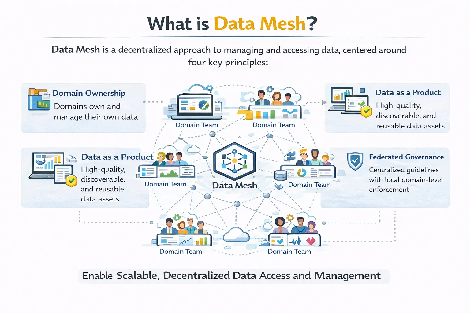
Categories
Blog Data Migration

Data Mesh vs Data Fabric: Which One Fits Your Enterprise Data Strategy?

As technology evolves, data terms are getting more confusing than ever.

First, there were data lakes. Then came data warehouses.

Now, every business is talking about data mesh and data fabric.

So, what do these terms actually mean? And which is the right one to choose for your business?

In this guide, I will help you understand data mesh vs data fabric. This will make your decision more informed and easier.

Let’s start by learning more about each method.


What is Data Mesh?


Infographic explaining what data mesh is, showing domain ownership, data as a product, federated governance, and decentralized data management.

Questioning what is data mesh vs data fabric? Well, we first need to define them

Data mesh is a way to organize your data processes easily. 

It involves each business domain taking responsibility for its own data.

While most companies rely on a central data team, this removes that requirement. It puts the data management and data warehousing in the hands of each department.

As each of your teams handles its data, they start treating it like a product. This includes being in charge of their own data cleansing process as well.

Also, this method helps other teams collaborate using the same data.

Key Principles: 

  • Domain ownership by each team 
  • Using data as a product, alongside its quality and documentation
  • Promoting self-service platforms managed by teams
  • Global governance of each domain 

What is Data Fabric? 


Diagram illustrating data fabric architecture with connected data sources, integration, governance, analytics, AI use cases, and business benefits.


Data fabric is quite different. It relies on a technology architecture instead.

In a data fabric, a virtual layer is created that connects all data sources in your business.

Such usage enables easier data finding and management across systems.

The main benefit of a data fabric is the level of connectivity it provides. It enables easier data migrations and teamwork.


Key Principles:


  • Making data discovery automatic and fully integrated 
  • Activating metadata of each data point
  • Provides AI-powered recommendations
  • Ability to work across both local and cloud data 


Promotional banner offering consultation to help organizations choose between data mesh and data fabric for an efficient data strategy.

Data Mesh vs Data Fabric: Key Differences

Here are the main differences between data mesh and data fabric

Aspect Data Mesh Data Fabric
What it changes Organization and culture Technology and architecture
Primary focus Who owns data How data connects
Implementation New team structures New technology layer
Best for Large organizations with many domains Complex, scattered data environments

Data Mesh vs Data Fabric vs Data Lake

Let’s dive deeper and compare these three popular data platforms

Concept What It Is Main Purpose
Data Lake A storage system Store raw data cheaply
Data Mesh An organizational model Decentralize data ownership
Data Fabric A technology architecture Connect data across systems

When to Choose Data 

I recommend that you choose Data Mesh when

  • There are clear business domains like sales and marketing at your company
  • You have a central team that is becoming a bottleneck
  • You have the required budget for this change 
  • The teams at your company are motivated to be data responsible 

When to Choose Data Fabric

Here is when you should opt for Data Fabric instead

  • All of your data is scattered across multiple systems 
  • You require automated discovery and integration for your data 
  • You don’t require the reorganization of your team 
  • You or your team requires real-time data access across sources

Can I use both Data Mesh and Data Fabric? 

Of course!

Many experts even recommend using both methods at large businesses.

Here is how you can do it

Layer What It Does Example
Data Mesh (Organizational) Defines who owns data The sales team owns the sales data product
Data Fabric (Technical) Connects the data products Automatically discovers and links sales and marketing data


Quick Decision Guide

Still feeling a bit confused

Here are sample scenarios where you should use either method

Your Situation Best Choice
The central data team is overwhelmed Data mesh
Data is scattered across 50+ systems Data fabric
You have clear, separate business domains Data mesh
You need real-time data integration Data fabric
You want to change both culture AND technology Both (mesh first, then fabric)


Conclusion 

Comparing data mesh vs data fabric is not really the right way to use them

They both are meant to solve two separate problems

These include

  • Using data mesh to fix your current organizational bottlenecks
  • Using data fabric to connect technical data integrations

For you, the right choice depends largely on your present and future needs.

To help make this issue easier, you should consult a dedicated software partner

My recommendation? Choosing our team at Augmented Systems for your every need

We have spent decades building trust in the industry as a valued partner. Our data strategies continue to bring the best ROI for global clients

Moreover, our team excels at both data mesh and data fabric integrations. We are experts dedicated to making your data work for you

Contact Augmented Systems today and connect with us to solve your data chaos. 


Call-to-action banner encouraging businesses to improve their enterprise data strategy with expert consulting services.

FAQs 


1. What is the difference between data mesh and data fabric?

The main difference between data mesh and data fabric is focus. Data mesh is an organizational model for who owns data (domain teams). Data fabric is a technology architecture for how data connects across systems (automated integration).

2. What is a data mesh example?

A data mesh example is a retail company where the sales team owns sales data, marketing owns campaign data, and each team publishes clean data products. Other teams access these directly without going through a central bottleneck.

3. Should I choose data mesh or data fabric?

Choosing data mesh or data fabric depends on your pain point. If your central data team is overwhelmed, choose data mesh. If your data is scattered across many systems you can’t connect to, choose a data fabric. Many companies use both.

4. How do data mesh, data fabric, and data lake compare?

Data mesh, data fabric vs data lake solve different problems. A data lake stores raw data cheaply. Data mesh organizes who owns data. Data fabric connects data across systems. They work well together, not as competitors.

5. Can data mesh and data fabric work together?

Yes. Many experts recommend using both. Data mesh defines who owns data products. Data fabric provides the technology layer that automatically discovers, connects, and governs those data products across domains.

Categories
Blog Data Visualization

Tableau vs Power BI: Which BI Tool Should You Choose?

With so many options, choosing the right business intelligence tool can be tough

Mainly, you will hear about two main choices. These are

  • Tableau
  • Power BI

Both are powerful ways of creating beautiful dashboards

But which one is right for you

To answer this question, I have created this detailed guide. It compares the benefits and weaknesses between Tableau and Power BI

Let’s get started. 


Tableau vs Power BI: Quick Overview


Here is a short comparison between these two data tools

Factor Tableau Power BI
Best for Complex data exploration Microsoft shops and budgets
Ease of use Steeper learning curve Easier for Excel users
Pricing More expensive More affordable
Data size Handles huge datasets well Good for medium to large
Visualization Industry-leading flexibility Good, improving quickly


Tableau or Power BI consulting services helping businesses choose the right BI solution


What is Tableau? 


What is Tableau data visualization tool used for business intelligence and data analysis


Tableau is a software used in data visualization services. It is mainly meant for exploring your data.

It was founded back in 2003 and rapidly became popular for the insights it generated

With Tableau, one can easily create visualizations from the available data

You can also drag and drop important data points in this program without having to write any code.

Thus, Tableau is a great data tool for data analysts and scientists. It supports deeper exploration into data points with minimal confusion. 


What is Power BI?


What is Power BI Microsoft business intelligence and data visualization software

Power BI is a Microsoft-developed software alternative for data analysis.

It was launched in 2014 and has been rapidly gaining popularity among its users

One of the best benefits of Power BI is its integration capabilities. It can easily connect to other Microsoft products using Power BI consulting

This makes Power BI ideal for businesses already working with Microsoft tools. 


Tableau vs Power BI: Key Differences


Let us now compare Power BI vs Tableau in greater depth. 

  • Ease of Use

In terms of ease of access, Power BI is a clear winner. 

The interface seems very familiar as it resembles Excel. Most business users can thus create basic reports without advanced learning.

In comparison, Tableau takes significantly more time to learn. 

  • Data Visualization

Tableau is a lot more flexible than Power BI. It can handle complex interactive visuals with ease. 

But Power BI is slowly catching up. This is because Microsoft continues to add new visual types to Power BI. 

  • Pricing 

Costs are where Power BI is a clear winner. It costs only about $10-14 per user per month. 

Tableau is significantly pricier. It can drive your costs up to $70-75 per user per month. 

For large enterprises, the high costs of Tableau can quickly add up. 

  • Data Connection

As I said before, Power BI has deep integrations with Microsoft products. Sources like Excel, Azure, and SQL are easy to set up. 

Tableau is great at everything else. Alongside Microsoft sources, it supports over 80 additional data sources.

Thus, for cloud databases and big data platforms, Tableau is the better choice. 


When to Choose Power BI


So, is Power BI better than Tableau? 

The answer depends on your situation. 

Here are scenarios where Power BI makes more sense: 

Situation Why Power BI
You use Microsoft tools Native integration with Excel and Azure
You have a tight budget Much lower per-user cost
Your team knows Excel Similar interface, faster adoption
You need basic dashboards Power BI handles most business needs


When to Choose Tableau


In comparison to Power BI, here is when you should use Tableau instead:

Situation Why Tableau
You explore complex data Tableau’s drag-and-drop exploration is unmatched
You need advanced visuals More customization and flexibility
You handle huge datasets Tableau performs better at scale
You have a budget for training Steeper learning curve, but more powerful


Can You Use Both Tableau and Power BI?


Yes, absolutely! 

Many companies use both Tableau and Power BI together for better efficiency. 

Here is how this hybrid approach works: 

  • You can use Power BI to handle standard reporting and dashboards
  • Switch over to Tableau for deeper data exploration and complex insights


Quick Decision Guide 


Still confused between the two tools? 

Here are my recommendations based on your needs: 

Question If Yes If No
Do you use Microsoft tools? Lean toward Power BI Consider Tableau
Is the budget a concern? Power BI Tableau is fine
Do you need advanced visuals? Tableau Power BI works
Does your team know Excel? Power BI Either tool works
Do you explore huge datasets? Tableau Both are fine


Business intelligence dashboard development services for better data visualization and analytics


Conclusion 

Comparing Tableau and Power BI clearly shows that both offer unique benefits

Power BI is great for businesses already using Microsoft tools. It provides standard data reporting at lower costs

Meanwhile, Tableau is an advanced tool that supports larger datasets. It can handle deeper data exploration at a premium price

To ensure you choose the right tool, I suggest partnering with a software consultant

You can gain better clarity by consulting our team of industry experts at Augmented Systems

We can help your business both select and implement the right Power BI tools. Moreover, our data analytics consulting keeps you up to date with the latest tools

Also, you will receive the clear, useful insights you need to scale your business today

So, are you ready to see your data more clearly? Simply contact Augmented Systems today and receive a free consultation for your data needs! 


FAQs 

1. Which is better: Tableau or Power BI?

The answer to the question of Tableau vs. Power BI depends on your needs. Power BI is better for Microsoft shops and tight budgets. Tableau is better for complex data exploration and advanced visuals. Both are excellent data visualization tools.

2. Is Power BI better than Tableau for beginners?

Is Power BI better than Tableau for beginners? Yes. Power BI has a gentler learning curve, especially for Excel users. Tableau is more powerful but takes longer to master.

3. Can I use both Tableau and Power BI together?

Yes, many companies use both Tableau and Power BI. Power BI handles standard corporate reporting. Tableau handles deep data exploration and complex visualizations. They complement each other well.

4. What are the main differences between Tableau and Power BI?

The main differences between Power BI and Tableau are pricing (Power BI is cheaper), ease of use (Power BI is easier), and visualization flexibility (Tableau wins). Your choice depends on budget, team skills, and data complexity.

5. Which data visualization tool should my business choose?

Consider professional data visualization services if you’re unsure. Experts can assess your needs, data sources, and budget to recommend the right tool. They can help you decide whether you need Tableau, Power BI, or both.

Categories
Blog Data Visualization

What Is Power BI and Why Businesses Use It for Data Analytics

Your entire business might be dependent on data.

But your data is useless if you cannot understand it.

For that, you need a unified system. One that combines your financials and customer data in a single view.

That is where Power BI dashboards come in. They provide the data insights your company needs.

Power BI is a business analytics tool that refines your messy data. It turns into clean, actionable reports.

So, what is Power BI? And how can it help your business?

Don’t worry, as I have created this guide just to answer that question!

With this guide, you will learn how to gain live visuals from your data. These will help you improve your business’s efficiency.

Let’s get started by first understanding the definition of a Power BI dashboard.

What is Power BI? Illustration explaining what Power BI is, including data connection, transformation, visualization, and dashboard insights workflow

In easy terms, Power BI is a tool that helps you both see and understand your data.

Think of it as a suite of tools used for business analytics that are powered by Microsoft. These tools help you prepare your data for analysis and gain valuable insights.

Here is what makes Power BI reporting so special:

  • Visual

Power BI converts your boring data rows into colorful charts and graphs.

  • Interactive

Instead of sheets, you will get clickable charts that update automatically.

  • Shareable

Boost your teamwork with online reports that work for your entire staff.

Why Businesses Use Power BI for Data Analytics?

Using Power BI for data analytics consulting has become crucial for any modern business.

Power BI dashboard and data visualization services helping businesses see data clearly and make informed decisions

Here are the reasons why:

  • Connect Everything Seamlessly 

You might be juggling multiple sheets and platforms at your workplace every day. Keeping your CRM and accounting separate adds to your workload.

But that is not the case for teams empowered by Power BI features.

With over 100 connections available, Power BI merges your data in a single place. This means no more switching between multiple systems for accurate data.

  • Create Visually Stunning Dashboards

One of the highlights of a Power BI dashboard is how it makes data easy to understand.

Power BI becomes your command center. It provides major metrics at just a glance.

Moreover, it also enables cross-team data integrations. This means easier executions and everyone staying on the same page.

Using Power BI, tracking your sales and inventory also becomes easier than ever!

  • Benefit From Shared Insights Across Your Teams

You might think Power BI is just a tool for analysts.

But in reality, its easy navigation makes it a tool for everyone!

Using Power BI, your teams can collaborate using the same data. This means sharing reports through online Power BI services.

You can also use apps and email subscriptions to make sharing easier. Moreover, Power BI also connects seamlessly with Microsoft Teams and SharePoint.

Power BI features for businesses including interactive dashboards, data connectivity, advanced analytics, and automated reporting

Best Power BI Features For Your Business 

While the Power BI features list is long, here are my top recommendations:

  • Rich Visualizations 

The core benefit of Power BI is its offering of over 150 data visualization services.

Whether it’s standard charts or complex maps, Power BI has got you covered. It even supports custom visuals you can build yourself.

Using Power BI, you can visualize sales over time and easily gauge performance.

  • Powerful Interactivity 

A great benefit of Power BI is how it makes data insights interactive.

Simply click on a visual and all related visuals update automatically.

For example, clicking “Q3” on a sales chart opens your entire quarter. You can then check your profits and customer map neatly on your dashboard.

  • Queries in Natural Language 

You don’t need to be an analyst to use Power BI. Just type questions in plain English and see your visuals come alive.

Queries like “show my total sales in this region” work very well. It makes it easier to use Power BI for your business.

  • AI-Powered Insights 

Power BI has built-in AI features that track errors and data patterns.

Using them, you can verify your data and generate reports using simple natural language.

Just click on a report or insight and select “Explain this increase”. Power BI will automatically analyze the data to provide an accurate result.

  • Consistent Metrics 

Using Power BI, you can create a single source of truth for your entire business.

It computes all of your data to provide consistent answers to your queries. This helps in keeping everyone on the same page.

Power BI Tools Included with the Platform 

Here are the Power BI tools you can use through the platform:

Tool What It Does Who It’s For
Power BI Desktop Free desktop app for building reports Analysts and report creators
Power BI Service Cloud-based sharing and collaboration Teams needing to share insights
Power BI Mobile iOS and Android apps On-the-go access to dashboards
Power BI Report Builder Create paginated reports Finance and operations teams
Power BI Embedded Embed reports in custom apps Developers

Power BI Reporting Examples 

Using Power BI, you can interactively report on your data.

Here are real-life scenarios where Power BI can help you:

Report Type What It Shows Who Uses It
Finance Insights Trial balance and financial statements CFO, finance team
Sales and Billing Sales order volumes and revenue trends Sales director
Accounts Payable Aging reports and payment trends Accounts payable team
Opportunity Insights Sales pipeline health and deal progression Sales managers

Getting Started with Power BI

Are you ready to try Power BI for your business?

Consider following these simple steps:

  1. Download the free Power BI Desktop platform
  2. Connect your data sources 
  3. Start building a simple chart by dragging fields across the canvas
  4. Create your dashboard by pinning your charts
  5. Finally, share your new dashboard with your team online

Data analytics and business intelligence solutions transforming data chaos into actionable insights for businesses

Conclusion

So, what is Power BI?

As we have seen, it is a tool that can turn your data into usable insights.

Whether you are a small emerging business or a global enterprise, Power BI can make you more efficient.

It helps save costs and make informed decisions for your business.

But to truly unlock its true potential, you will need a software partner by your side. Someone with real-world experience with Power BI.

For you, that partner is Augmented Systems. They are your best bet towards making Power BI work for your company.

Augmented Systems has decades of experience solving real-world business problems. They can provide you with the Power BI consulting you need.

Their experts can customize Power BI dashboards for your work culture. Moreover, they can also help you create and implement your Power BI dashboards. 

Consult Augmented Systems today to start using your data in the best possible way! 

FAQs 

1. What is Power BI in simple terms?

What is Power BI? It’s Microsoft’s tool that turns your messy data into easy-to-understand charts and dashboards. Think of it as Excel charts on steroids, but interactive and live.

2. What are the main Power BI benefits for businesses?

Power BI benefits include faster decision-making (see data in real time), a single source of truth (everyone uses the same numbers), lower costs (about $10-14 per user per month), and beautiful dashboards anyone can understand.

3. What does a Power BI dashboard look like?

A Power BI dashboard is a single screen that shows your most important metrics at once. This includes sales trends, customer data, and financial performance. Click on any chart, and everything else updates automatically.

4. What Power BI features should I know?

Key Power BI features include 150+ chart types, natural language queries (just type your question), AI-powered insights, and the ability to share reports in Teams or on mobile phones.

5. What Power BI tools are included?

Power BI tools include Power BI Desktop (free for building reports), Power BI Service (cloud sharing), Power BI Mobile (phone apps), and Power BI Report Builder (for printable reports).